Mockup by Antony Boyd Design

What is RemotReach?
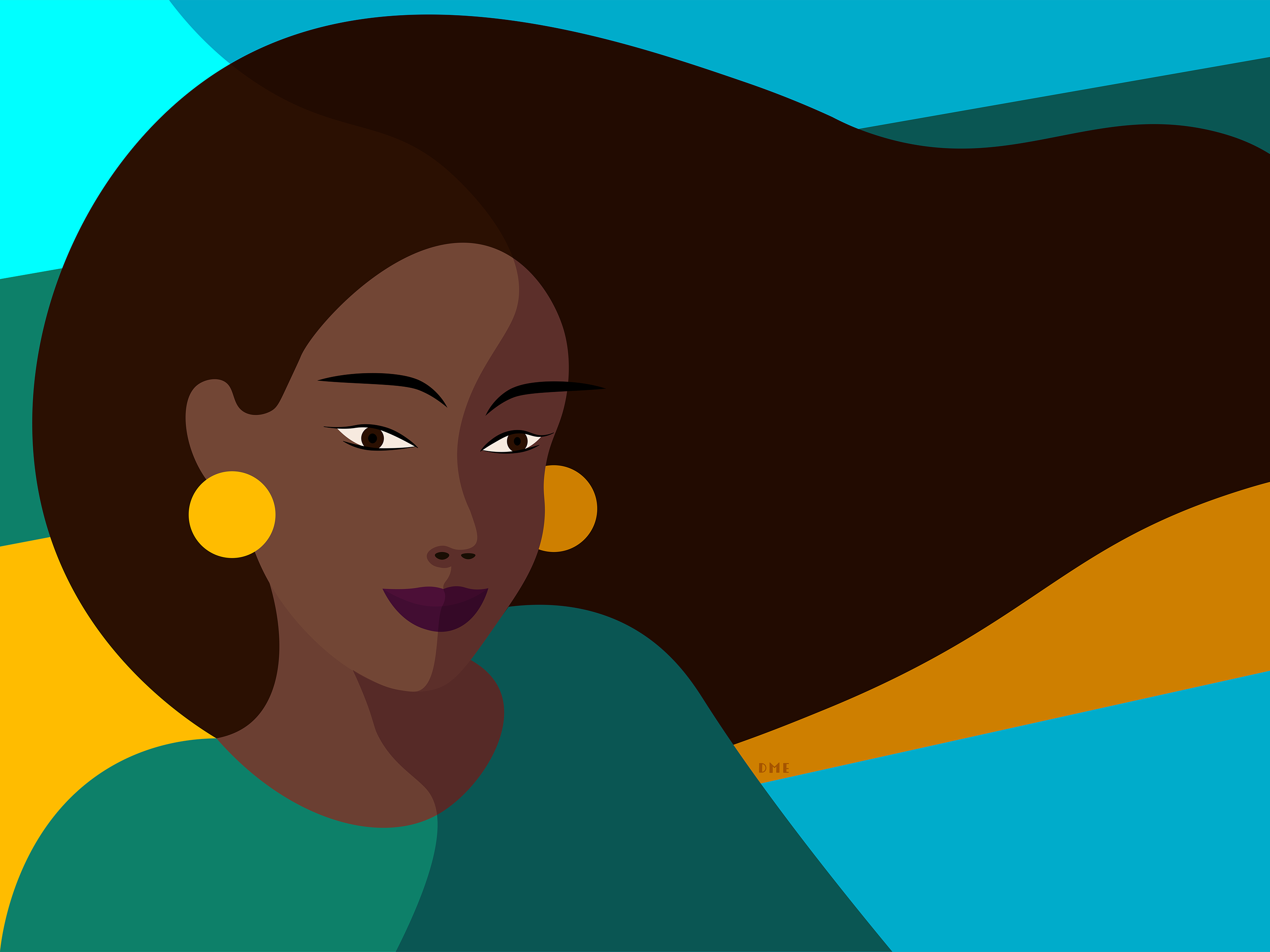
RemotReach is a mobile app that connects remote volunteers all over the USA and around the world to non-profits. (click on image)

Summary
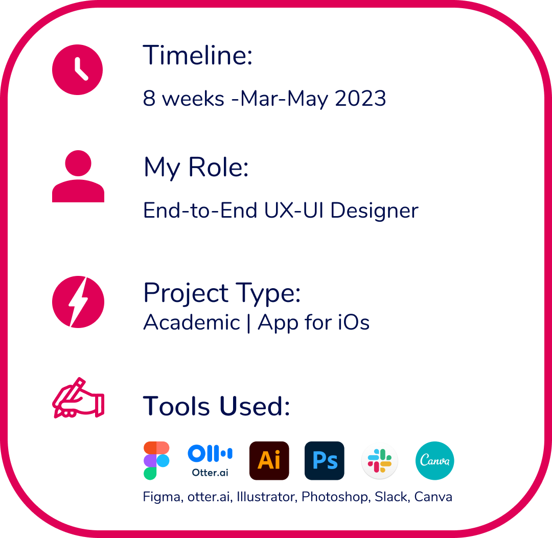
During my intensive UX-UI program, I conceptualized and developed a remote volunteering application as my capstone project. Serving as the sole end-to-end designer, I applied the comprehensive skill set I acquired over a three-month period to bring this digital solution to life.
The project encompassed various stages, including extensive research, conducting interviews, employing affinity mapping techniques, fostering creative ideation, and crafting a compelling brand identity based on my target user.

My Assumptions
I was always interested in understanding how people achieve a high level of physical and mental wellbeing. One thing that I knew from reading studies and books, listening podcasts and shows, and observing folks around me was that oftentimes, a sense of community was important to this process. I also theorized that a blend of personal values and belief systems, specific practices, and physical activities would result in the best possible state of satisfaction.
That is why I wanted to work in that space: after all, happiness is an aspiration worth pursuing, so let's me show you my process.
Methodology
I followed the Design Thinking methodology throughout this process.
Design thinking is a human-centered approach to innovation that draws from the designer's toolkit to integrate the needs of people, the possibilities of technology, and the requirements for business success.

My first step was to initiate the process by conducting thorough research.


Problem Space
Volunteering not only benefits the community but also offers significant personal development opportunities: through engaging in volunteer work, individuals can gain new skills, broaden their horizons, expand their network, build self-awareness and empathy, which provides a sense of fulfillment and purpose. Unfortunately people may not have enough time or resources to engage in volunteer work.
Secondary Research
The pursuit of happiness is shared by people from all walks of life. However, it is worth considering whether this quest can be accomplished through external factors or an internal state of being.
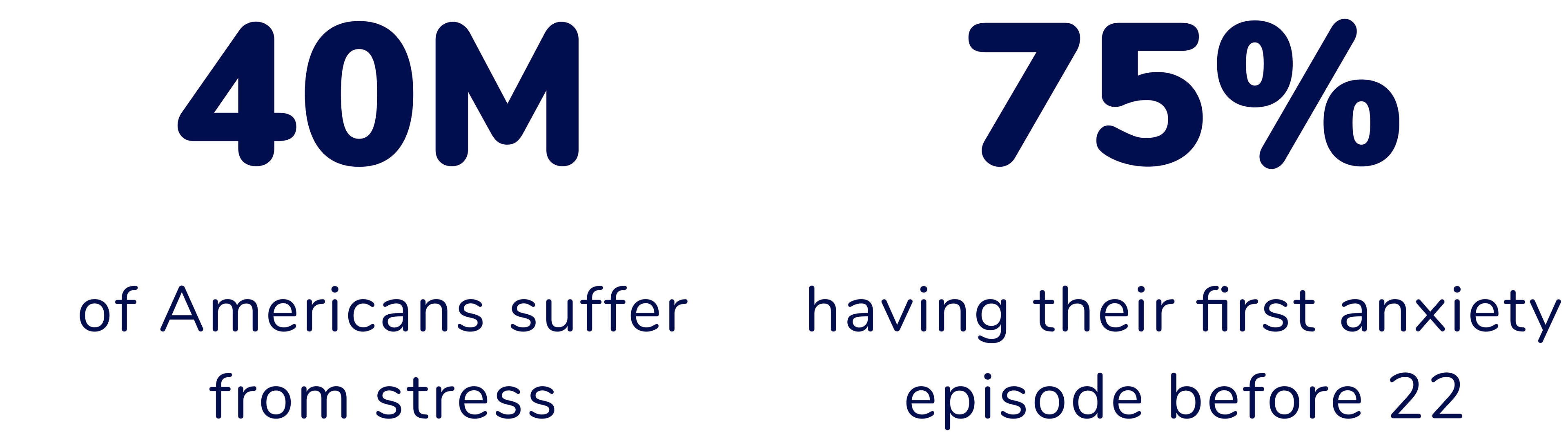
According to research stress can disrupt our sense of well-being, affecting us in various ways. Since the COVID19 Pandemic, the numbers are on the rise since: stress and anxiety can be a significant contributor to people's unhappiness.
Shockingly, studies reveal that 40 million Americans experience stress, with 75% of them having their first anxiety episode before the age of 22!
Faced with these staggering numbers, I decided to research what types of activities could help combat stress and increase life satisfaction.
Research Insights
Through my secondary research, I gained valuable insights about stress' factor and strategies for coping and managing it effectively. One recurring theme that often emerges is the importance of having a strong community and the sense of belonging it brings.

scroll down for sources
Hypothesis
I believe that there are certain common practices that bring happiness to emerging adults who engage in them. If more than half of the interviewees engage in these practices, I believe that I can leverage this information to create a digital solution.
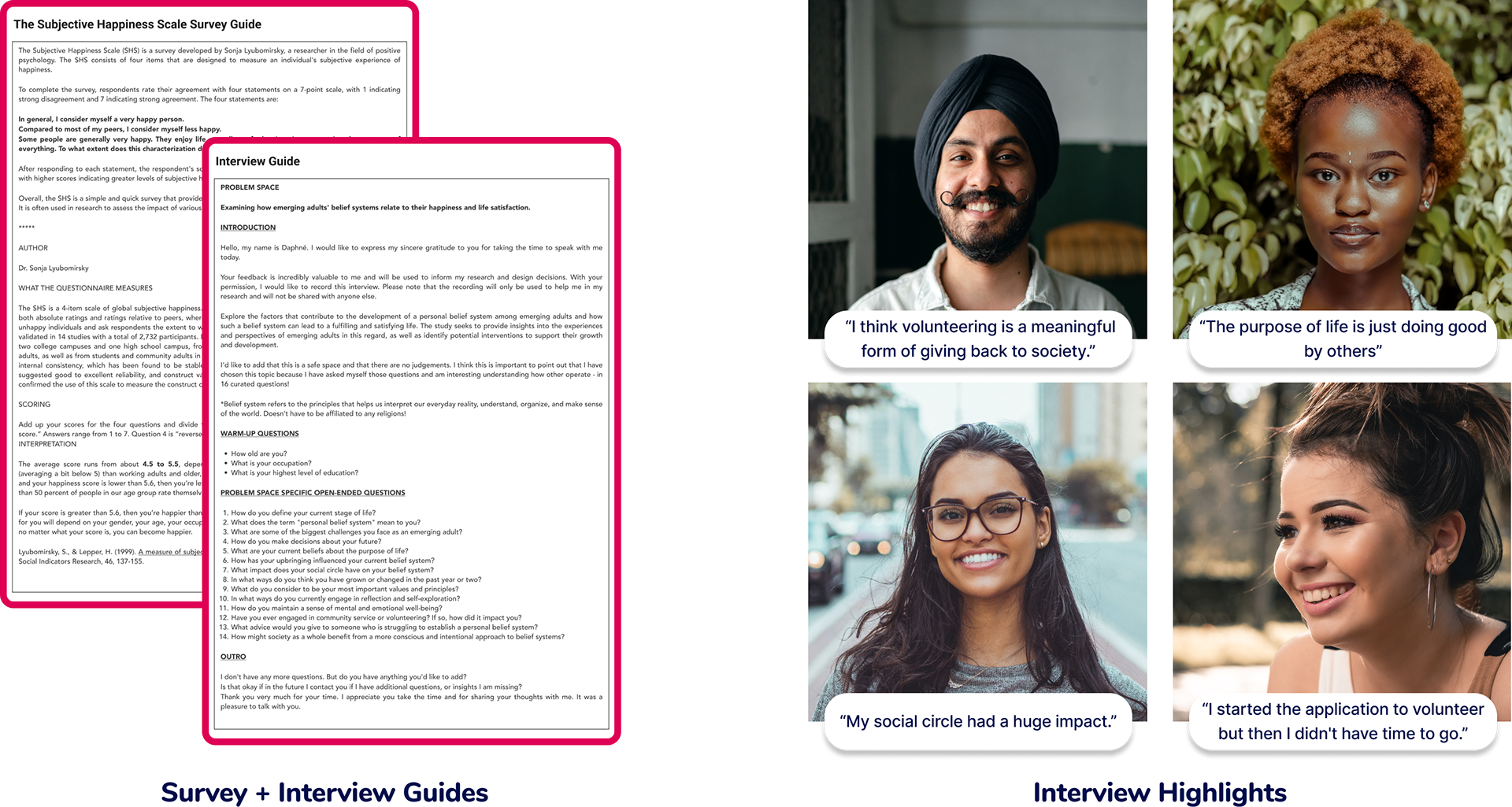
Primary Research
As my next step, I conducted user decontextualized interviews.
They were aimed at participants:
- Aged 18 to 29
- Minimum of a high school education
- With an interest in growth development.
In order to explore the factors that contribute to a fulfilling and satisfying life I created a open-ended questionnaire and conducted interviews.
Subsequently, I also sent them Subjective Happiness Scale Survey to gain insight into their overall well-being.
Subsequently, I also sent them Subjective Happiness Scale Survey to gain insight into their overall well-being.
Affinity Mapping
The purpose of an affinity map is to organize and make sense of large amounts of user research data collected during my interviews by creating color-coded visual representations of the data.
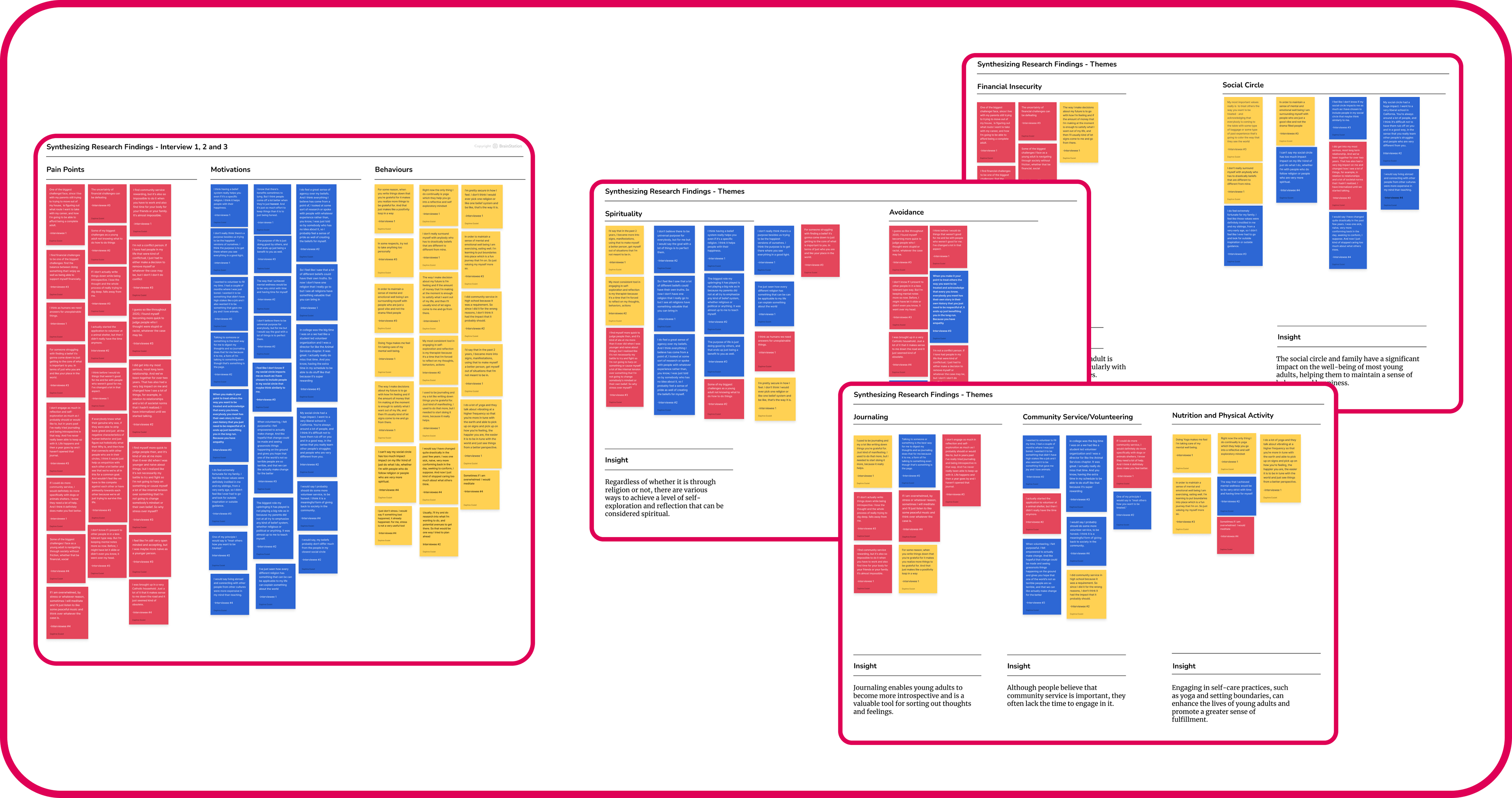
This process helped me identify patterns, trends, and commonalities across user responses from which I can validate my assumptions.
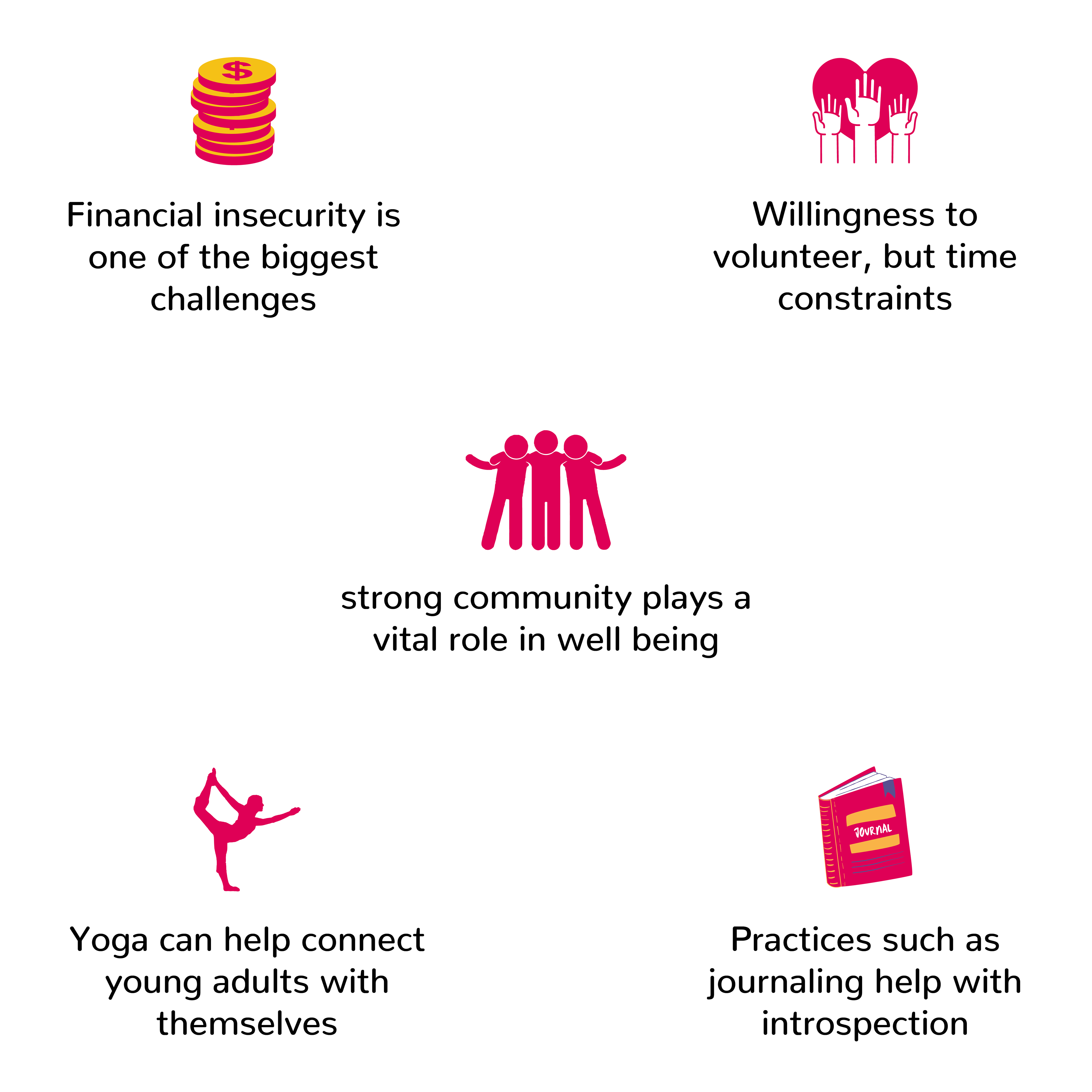
Main Themes and Insights
After conducting the interviews, I found that the assumptions I had made based on the research were mostly validated. Recurring themes such as the importance of strong community, volunteering, as well as self-care practices like journaling and yoga were mentioned several times. Additionally, financial instability and life's uncertainty were major causes of anxiety among the participants.
Previously Chosen Theme and Pivot
Although none of my interview participants were currently volunteering, they expressed interest in doing so if they had more time. They all spoke positively about their past experiences and the joy it brought into their lives. Initially, I believed that I wouldn't be able to overcome these time constraints and leaned into another solution to work on: online journaling app; however, after doing some research I pivoted onto a new solution: online volunteering.
This solution offers individuals the opportunity to develop a sense of purpose, build connections and collaborate with others, fostering a strong community bond. Moreover, it enhances their professional skills and expands their network for future prospects.
This solution offers individuals the opportunity to develop a sense of purpose, build connections and collaborate with others, fostering a strong community bond. Moreover, it enhances their professional skills and expands their network for future prospects.


How Might We?
With the help of primary and secondary research, came the question:

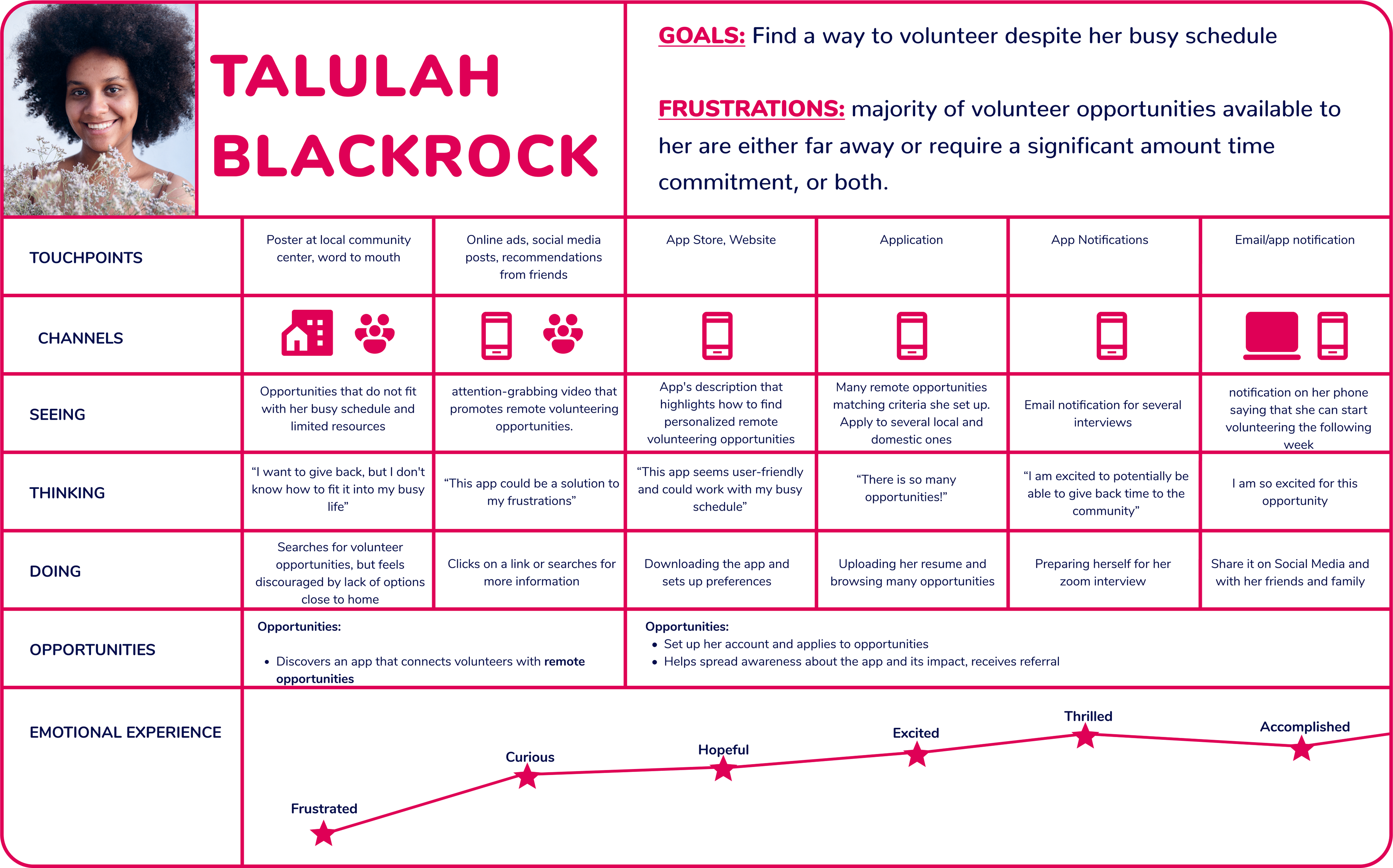
Persona + Experience Map
Inspired by my interviews, I came up with my target user. Through creating the affinity map I identified opportunity where Talulah could that would help Talulah find a remote position.

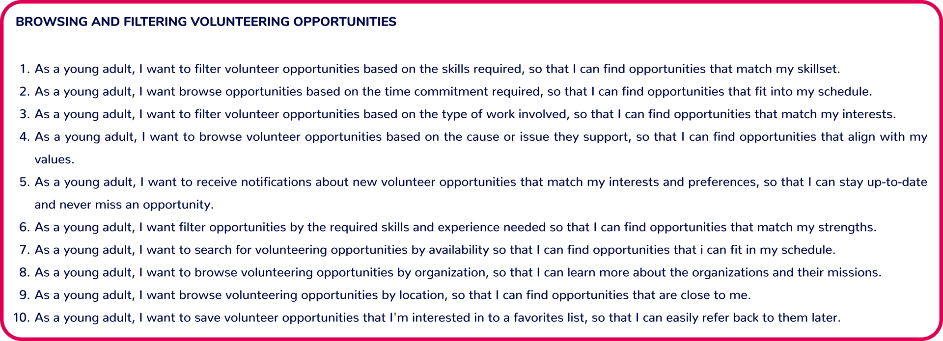
User Stories
The User-centered design (UCD) process outlines the phases throughout a design and development life-cycle all while focusing on gaining a deep understanding of who will be using the product.
I developed various user stories and organized them based on shared l themes (Epics) so to address Talulah's, these stories allowed me to build a task flow
I developed various user stories and organized them based on shared l themes (Epics) so to address Talulah's, these stories allowed me to build a task flow
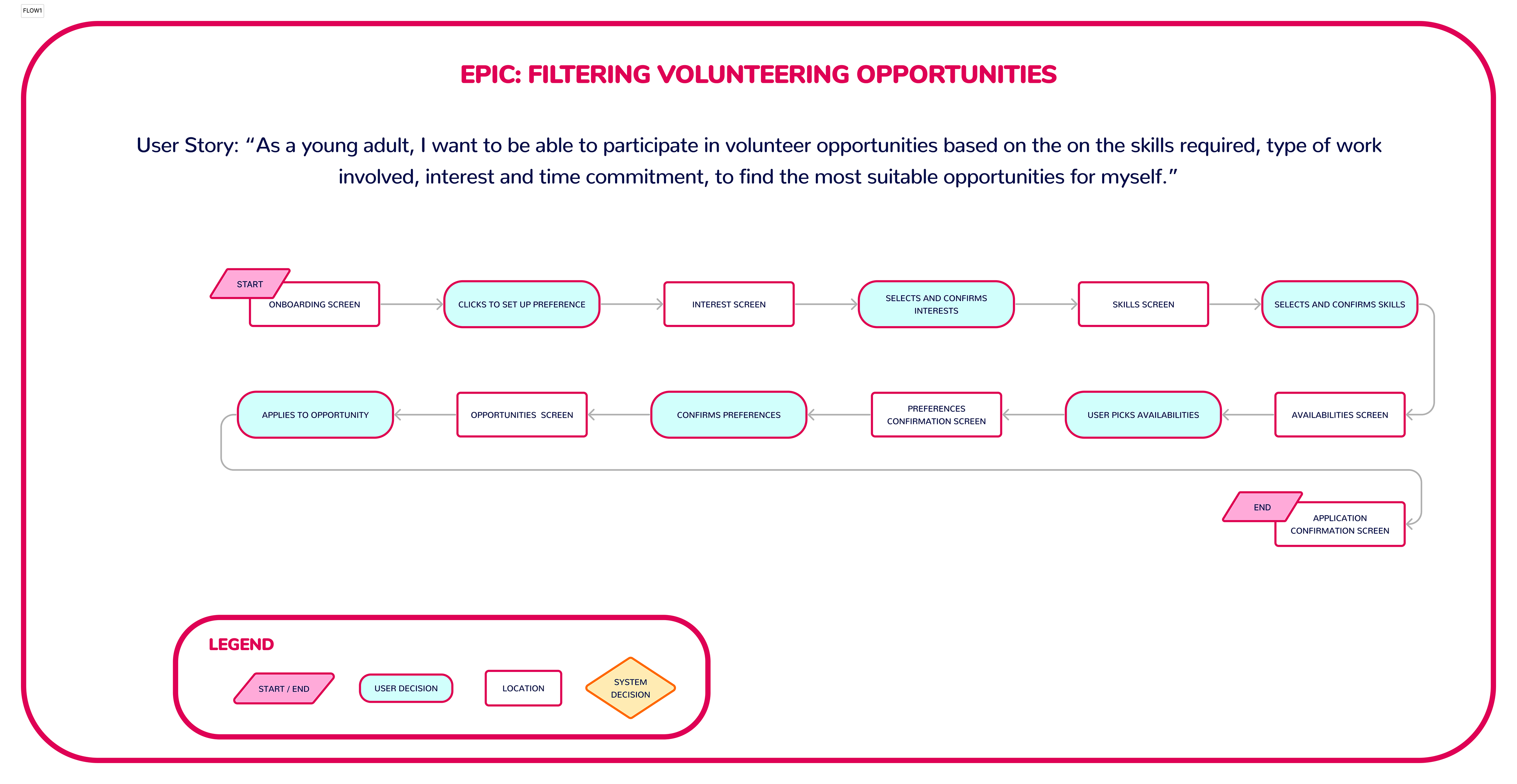
Task Flow
User stories allowed me to paint a bigger picture of Talulah's need so that I can develop my product further. By merging various user stories, I developed a task flow that considers variables such as time commitment, type of work, and availability.
This task flow outlines the user flow logic that Talulah will use her first time on the app.
This task flow outlines the user flow logic that Talulah will use her first time on the app.


UI Inspiration Board
My first prototype was focused on functionality so I could conduct my first round of user testing in a timely manner. I did seek some UI inspiration yet my main goal was to keep it simple. I deliberately avoided adding too much “personality” besides choosing a font and a grayscale palette for hierarchy, which I felt was more important at the time.

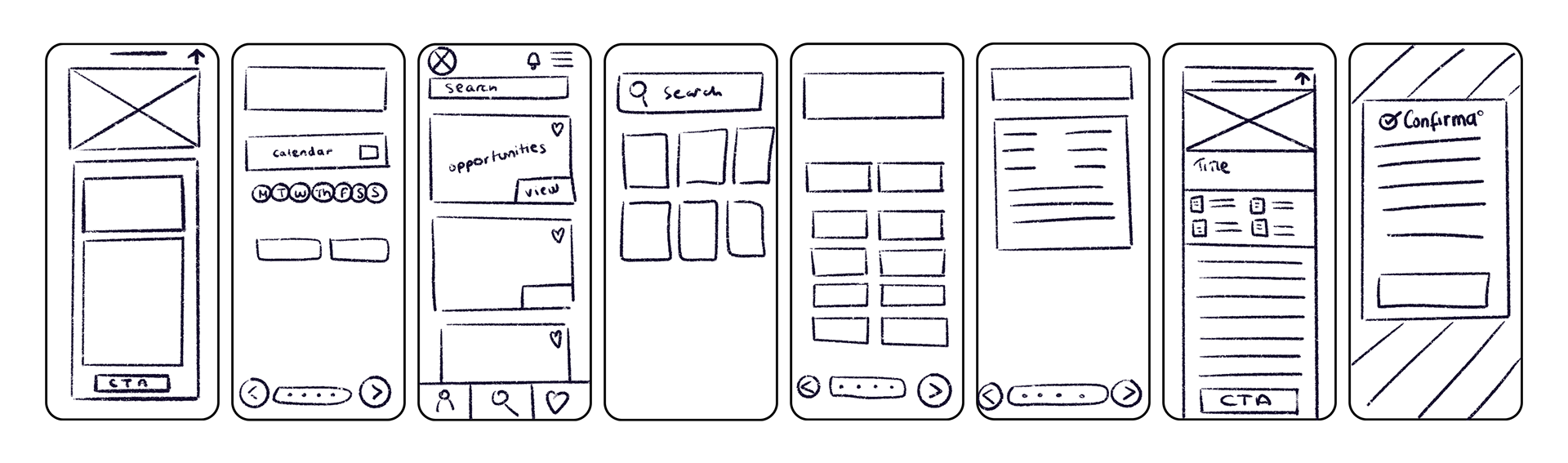
Exploratory and Solution Sketches
Based on my UI Inspiration Board I sketched many variations of my screens that were represented in the task flow diagram then picked the ones I felt were best for the app.
These sketches include a Skills and Interests, availabilities, set up and confirmation screens, opportunities. Here are the final sketches:

Grayscale Wireframes
During this phase, I utilized the solution sketches and UI Inspiration Board to transform the analog paper sketches into a preliminary collection of grayscale digital wireframes and an interactive prototype. Using Figma, I created my first prototype to test usability with my user target.
Prototype #1
My first prototype was focused on functionality. I did seek some UI inspiration yet my main goal was to keep it simple. I focused on choosing a legible font and a grayscale palette for hierarchy, which I felt was more important at the time. I glad I went that route, because my first round of feedbacks lead me to subsequently update my initial user flow.

Usability Testings
UI usability testing is the process of evaluating a digital product's user interface through user testing to identify any design or usability issues that could hinder user experience. The aim is to gather feedback on how to improve the interface to make it intuitive, efficient, and user-friendly. I conducted two rounds of live tests and updated the prototype twice during the process, resulting in two extra prototypes - making it a total of three. As I received feedback, I had to modify the initial task flow to reflect these changes, which I will present subsequently.
User Testing #1
During the first round of design testing, all participants were able to complete all activities.
The feedback mainly focused on cosmetic concerns, such as an excessive number of choices on the second and third screens and insufficient spacing. Additionally, it was noted that the opportunity description in my first prototype had all the first letters capitalized.
The feedback mainly focused on cosmetic concerns, such as an excessive number of choices on the second and third screens and insufficient spacing. Additionally, it was noted that the opportunity description in my first prototype had all the first letters capitalized.

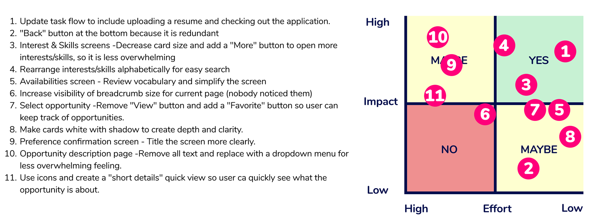
Prioritization Matrix #1
Prioritization methods can be used to prioritize the tasks at end, as they need to be solved into a strategic timeline. (Nielsen Norman Group)
During this process, I am using a impact–effort matrix: this is a 2D-visual that plots relative user value against implementation complexity.
I documented all the feedback we received during the testing sessions and included it in the matrix.
New Task Flow
During the testing, several participants asked about the ability to upload a resume since it was their first time logging in and applying on the app. After evaluating their feedback, I agreed that it was a reasonable request and updated the task flow accordingly. I added a few steps to reflect these changes.

I went back into Figma and started to work on screens so I could present a revised prototype.
Revised Prototype

User Testing #2
In order to prepare for my second round of user testing, I updated my questionnaire to align with the updated task flow. Although I was only able to interview 3 participants, all of them successfully completed the activities.

Prioritization Matrix #2
Similarly to the initial iteration, I developed a new prioritization matrix. However, this time there were fewer items requiring modification—only half of the tasks—and these primarily involved minor details and wording adjustments.

Final Grayscale Prototype
For my final prototype, I decided to add some fun illustrations to make the onboarding process more enjoyable and exciting for the user. These screens are ephemeral, meaning they are just present for a second or less, and use as transitions.

Now that the grayscale prototype have been tested, it is time for some colors!


Brand Development
Brand development refers to the process of creating and establishing a brand's identity that resonates with the target by using consistent and cohesive brand image.
My first step was to define the overall vibe and tone of the app. From there, create an aesthetic that aligns with the digital solution and finally, implement these elements into my prototype. By doing this, I hope to create an engaging and user-friendly platform that will connect non-profit organizations with emerging adults.
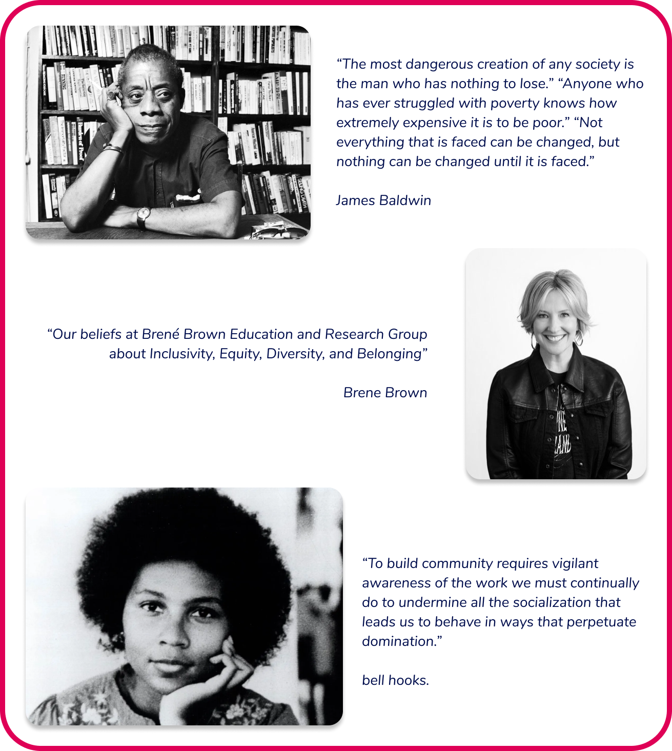
Inspirations
I started my process by researching inspiring quotes and keywords from leaders I admire revolving around the theme of community. My objective was to develop a mission statement that captured the essence of my digital product's purpose.
Here is what I came up with:
"At [app name], we're all about paying it forward through meaningful partnerships. We connect non-profits with passionate volunteers who are committed to creating real impact. Join us in building a better community through true cooperation and lasting relationships."
Inspiring Words
After clarifying my ideas and identifying my project scope, I created a list of adjectives that described how I wanted users to feel when interacting with my product.
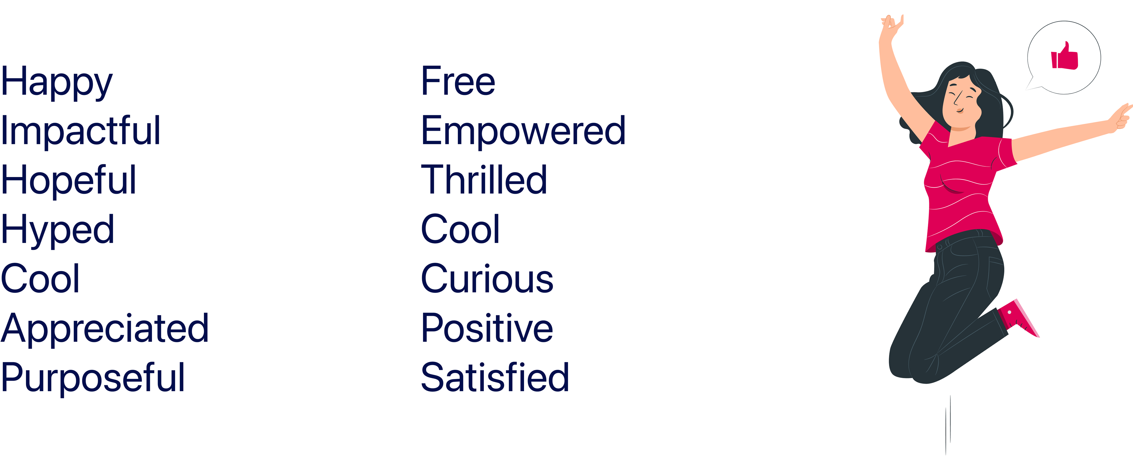
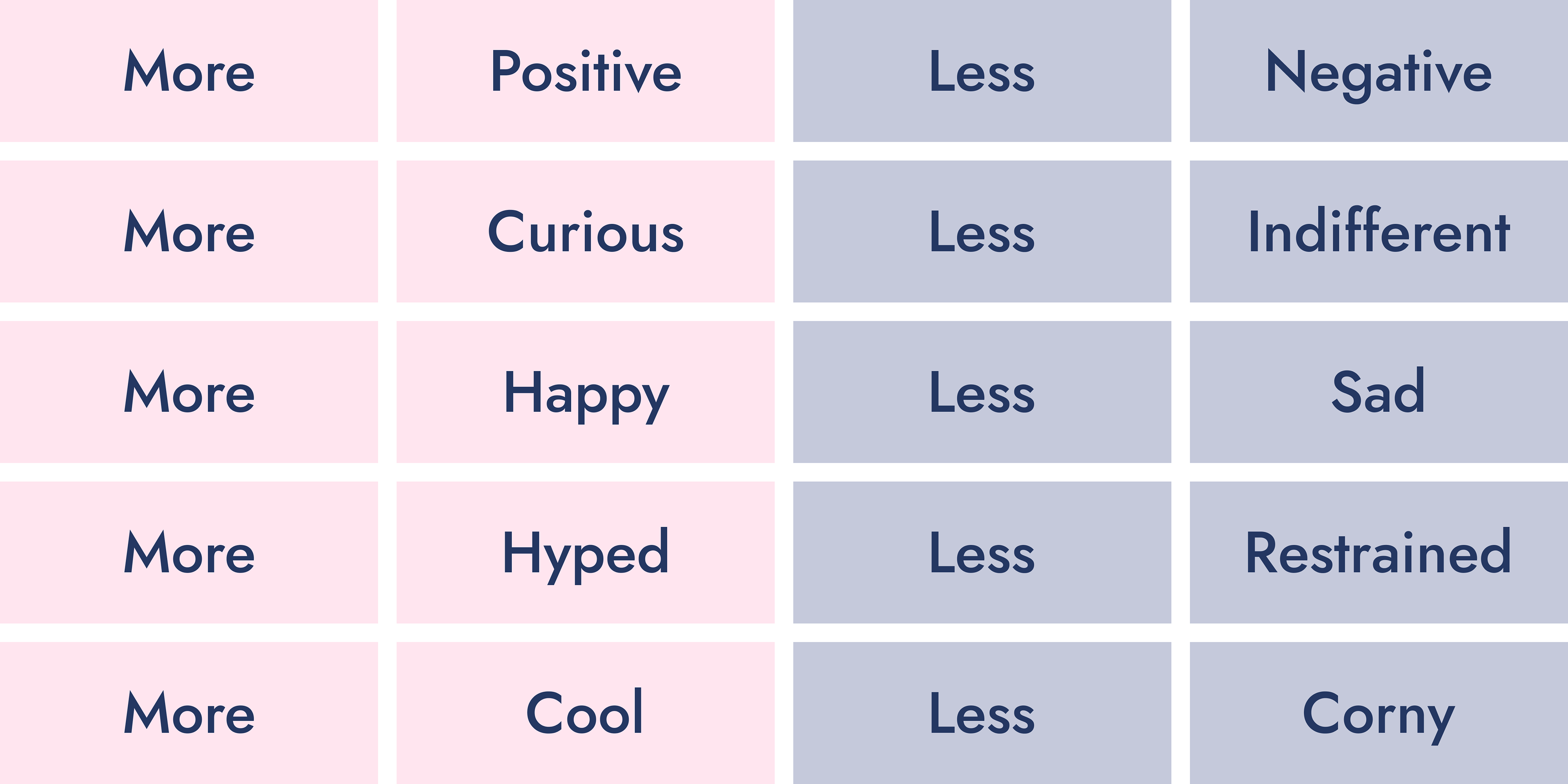
More/Less
I narrowed down my list of adjectives to five keywords to further focus my efforts. I then created a list of opposite words and began collecting images for my next step, which was to create a moodboard.
Moodboard
For my moodboard, I opted for an agile approach and created different iterations to gradually narrow down my selection. My first moodboard was a large collection of images: this way, it would be easier to pick similar vibes and narrow it down.
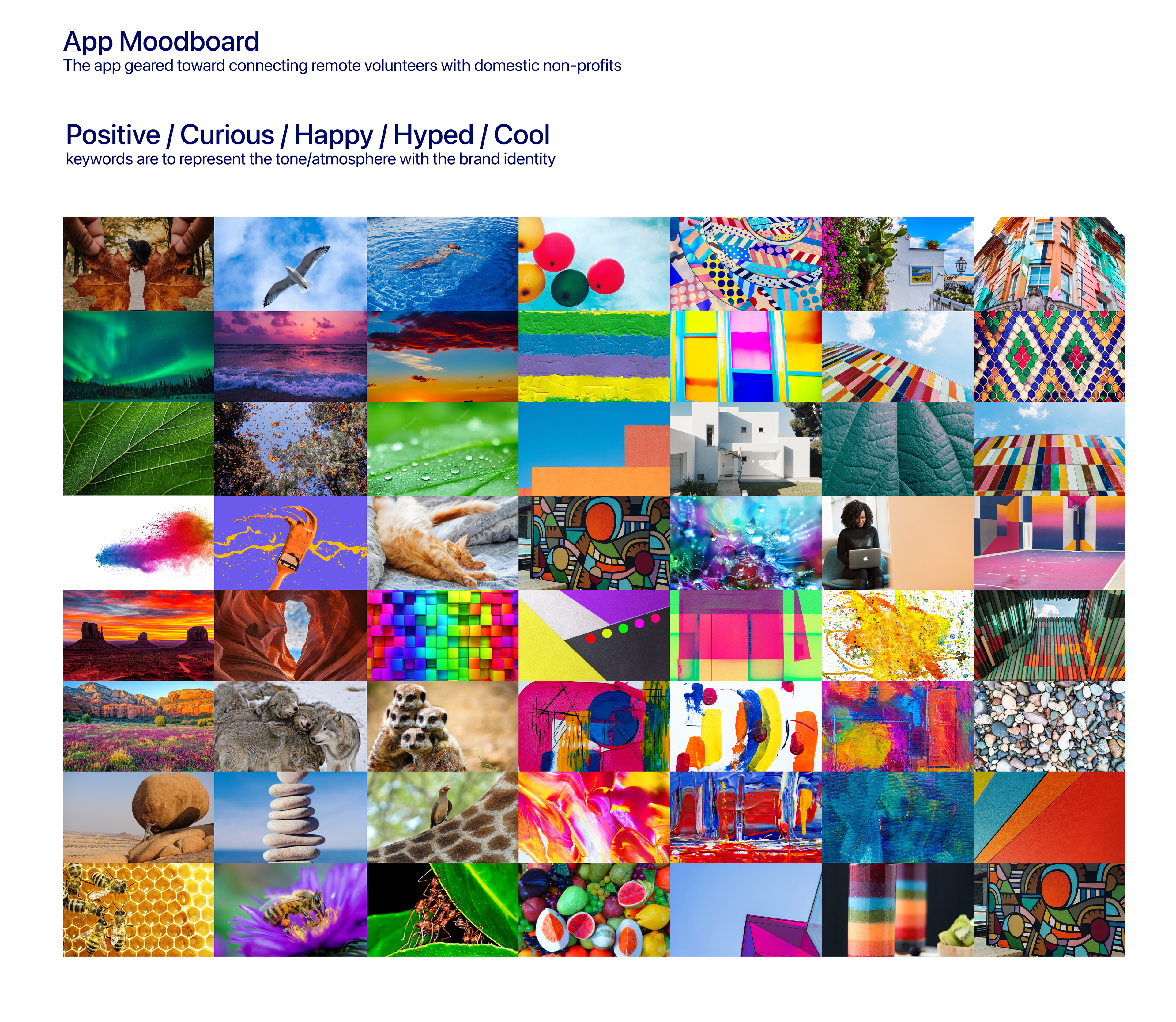
Throughout the moodboarding process, I kept my list of keywords close by to ensure that the images and colors I selected reflected the intended feelings. Finally I extracted a set of 5 colors for each moodboard.
After considering several iterations, I ultimately selected one titled "Bright and Grandiose."
From there, I extracted then fine-tuned the colors by calibrating them to my liking.
After considering several iterations, I ultimately selected one titled "Bright and Grandiose."
From there, I extracted then fine-tuned the colors by calibrating them to my liking.

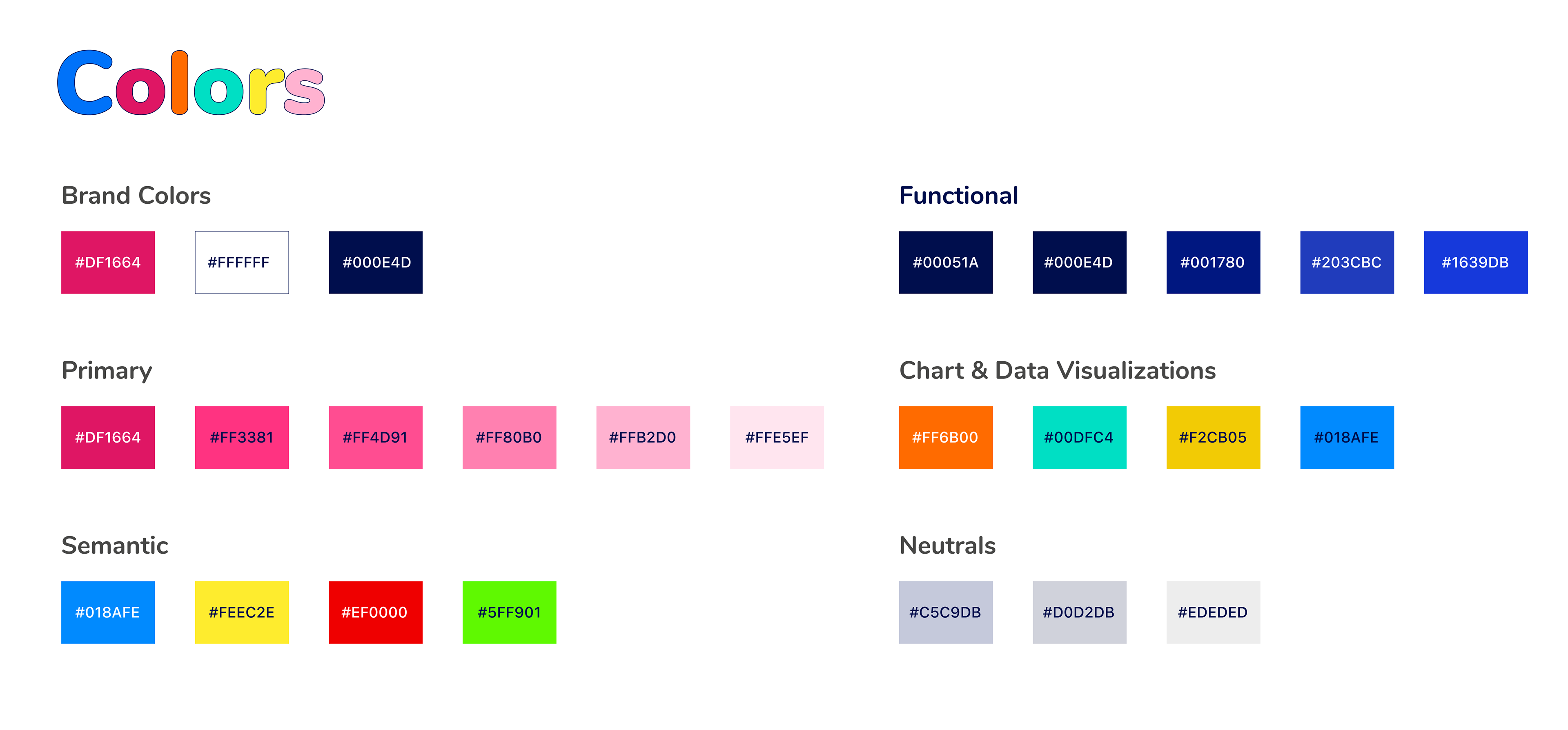
Brand Color
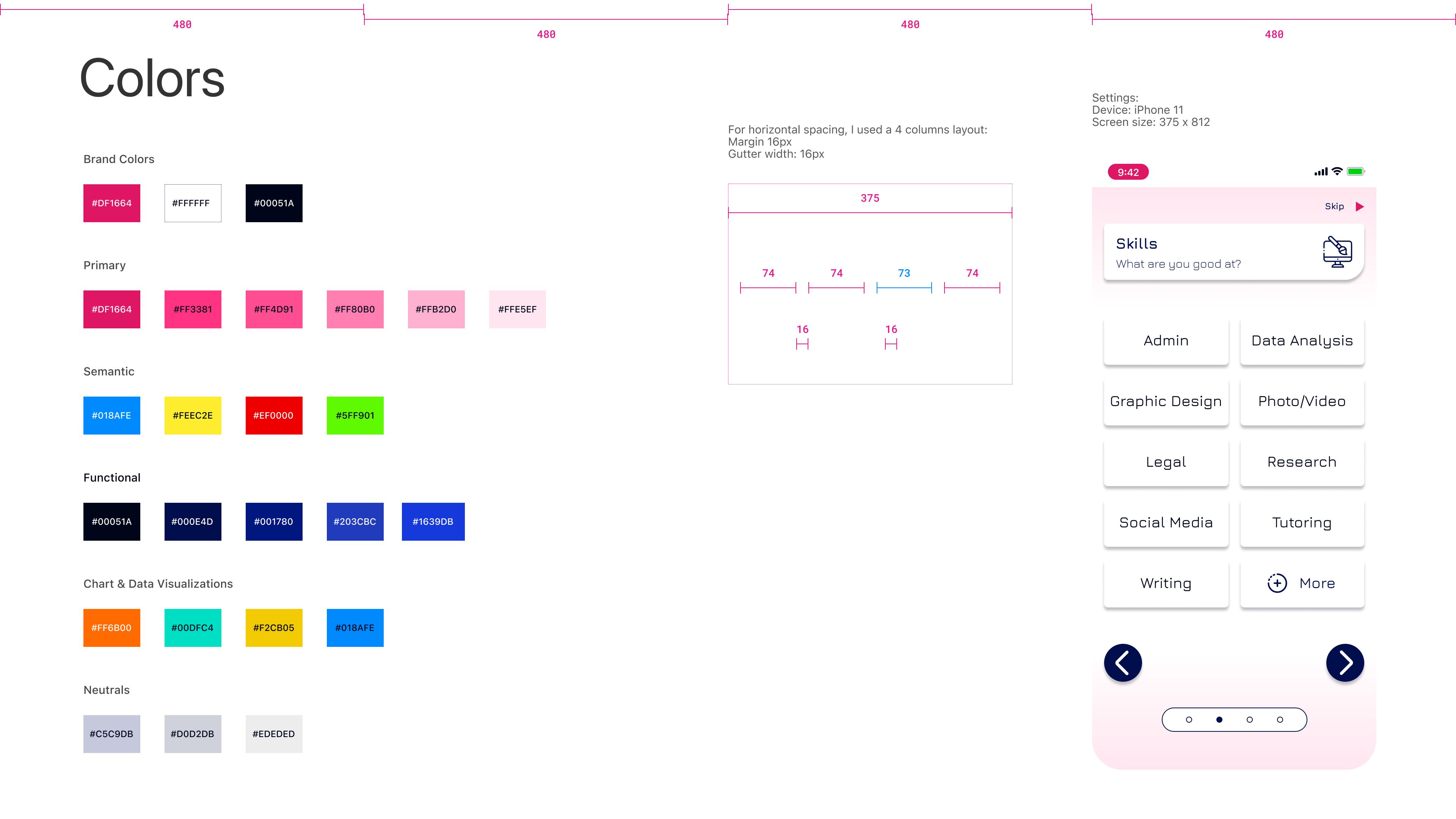
To create my brand colors, I selected one accent color and two neutrals. The accent color I chose is a bright pink cherry that conveys a sense of excitement, and is very bright and impactful. I paired this with a very dark shade of blue and white to create a harmonious and versatile color scheme.

From the brand colors, I created gradients by gradually decreasing their value. I will used these colors for text, navigation etc... (functionals) and background neutral. Additionally, I adjusted the hue to create additional colors that could be used throughout the digital solution while ensuring that they maintained the same saturation and value as not to clash with the brand color.
Colors
From the brand colors, I created gradients by gradually decreasing their value. I will used these colors for text, navigation etc... (functionals) and background neutral. Additionally, I adjusted the hue to create additional colors that could be used throughout the digital solution while ensuring that they maintained the same saturation and value as not to clash with the brand color.
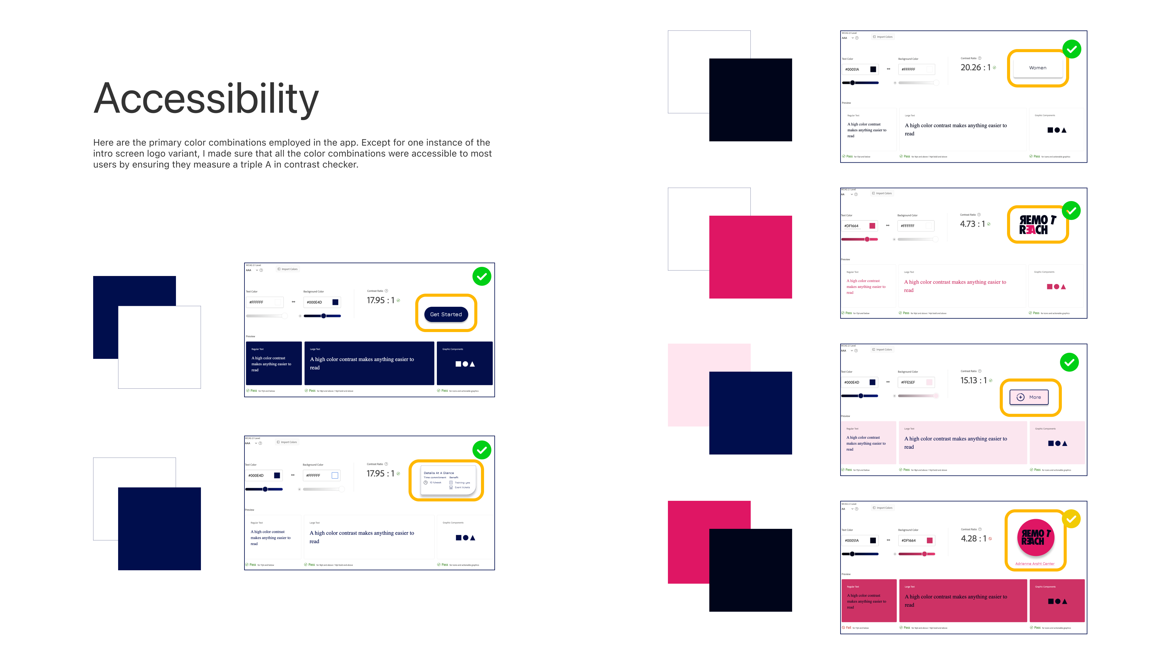
Accessibility
According to the Web Accessibility Initiative Web accessibility means that websites, tools, and technologies are designed and developed so that people with disabilities can use them. More specifically, people can:
- Perceive, understand, navigate, and interact with the Web
- Contribute to the Web
With this perspective in mind, I made the decision to select an accessible font and conducted accessibility testing specifically for the main component colors. This step was taken to ensure that the overall design would be inclusive and meet accessibility standards.
Now that i have decided on colors, and that I have a strong idea of the vibe of my digital solution, I decided to brainstorm additional name for my app.
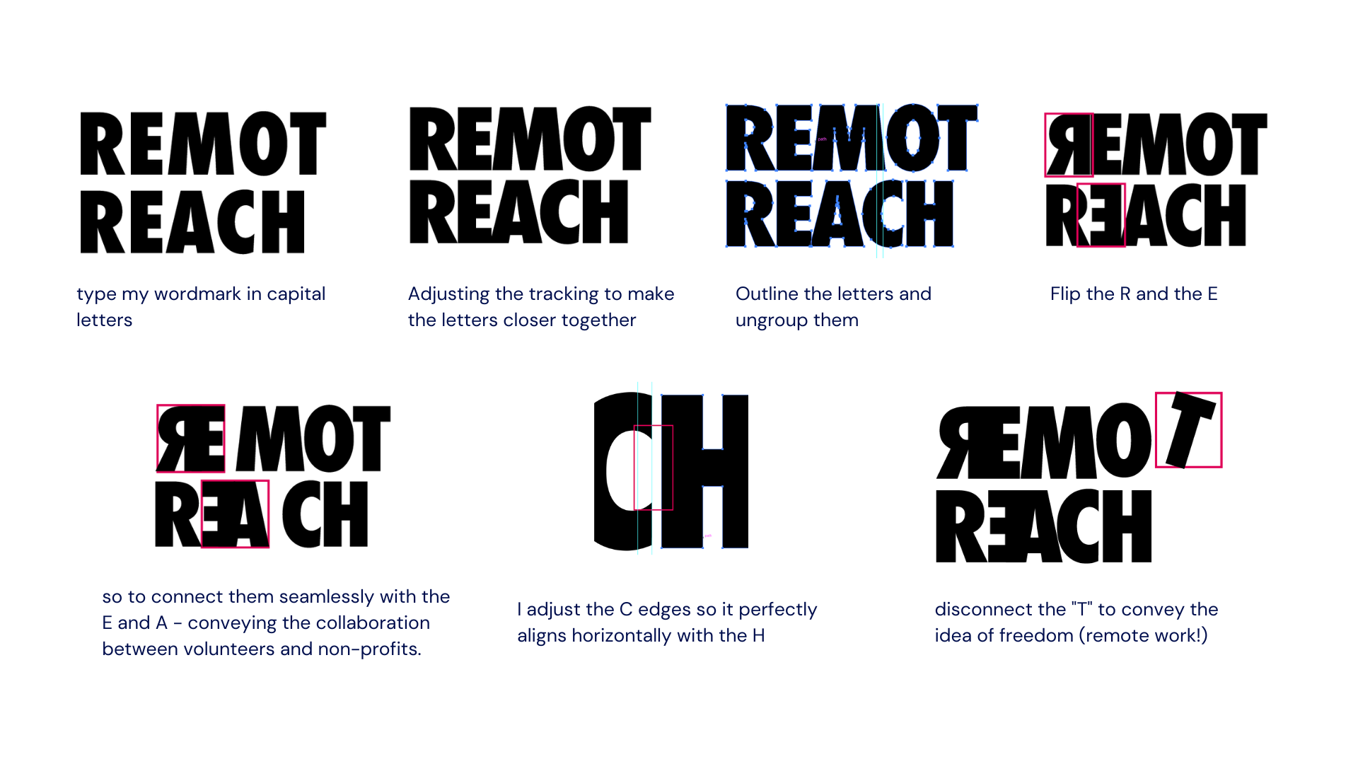
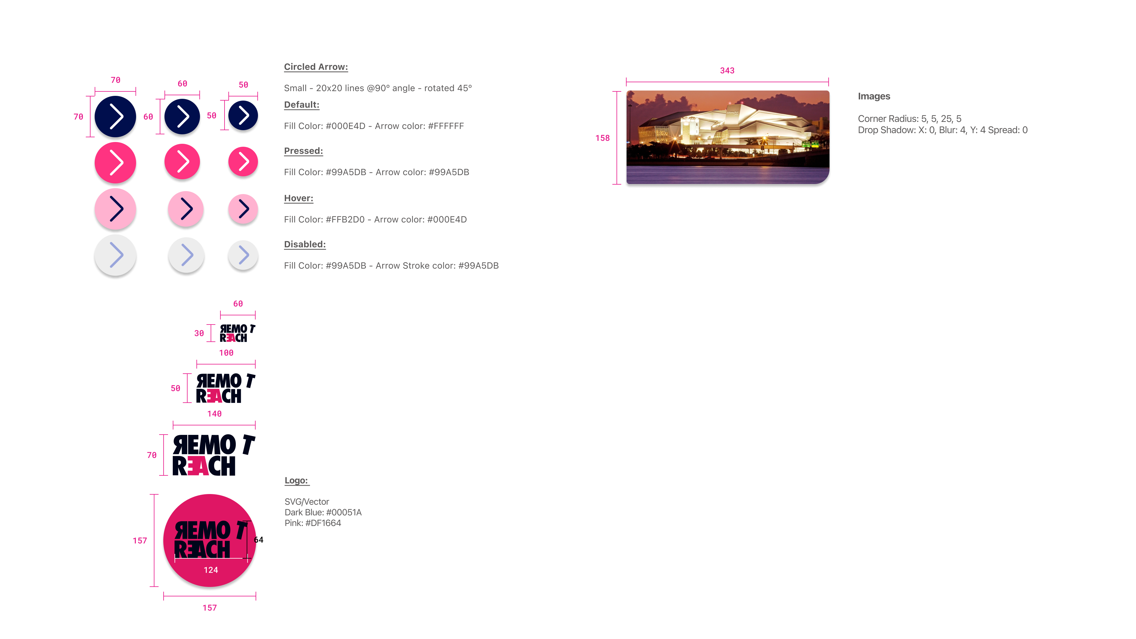
Wordmark Font
After experimenting with various fonts and styles using Adobe Illustrator, I chose to use the font Futura Condensed Extra Bold in all caps for my wordmark.
This is a sans-serif typeface with a clean, modern, and geometric design. It is widely recognized for its legibility and readability. It is a font that can be used for both personal and commercial use. Here’s my creative process in action:

Now that I have my colors picked out my colors and a logo, i am ready to use these on my grayscale wireframe.
This process is time-consuming as I need to find the right balance and use them correctly.
After injecting colors into one screen and finalizing the theme, fonts, and their placement within containers, I am now ready to proceed with injecting colors into all of my screens.


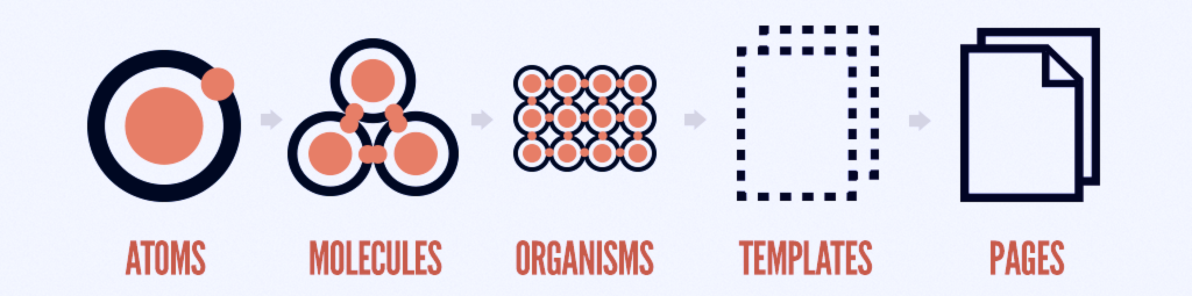
Atomic Design
Atomic design is a methodology based on breaking down the design elements into smaller, more manageable parts called atoms. These atoms are then combined to create molecules, which are simple groups of atoms that work together to form a specific UI element, . Molecules can then be combined to form organisms, which are more complex UI components like a navigation bar or a search bar. Finally, all of these elements are combined to form templates and pages, creating a cohesive design system that is both scalable and efficient.
Colors
The colors extracted from my moodboard allowed me to create the first atom element: color library - as well as the soft grids to the screens, which helped me measure increments and column widths.
Accessibility
Here are the primary color combinations employed in the app. Except for one instance of the intro screen logo variant, I made sure that all the color combinations were accessible to most users by ensuring they measure a triple A in contrast checker.

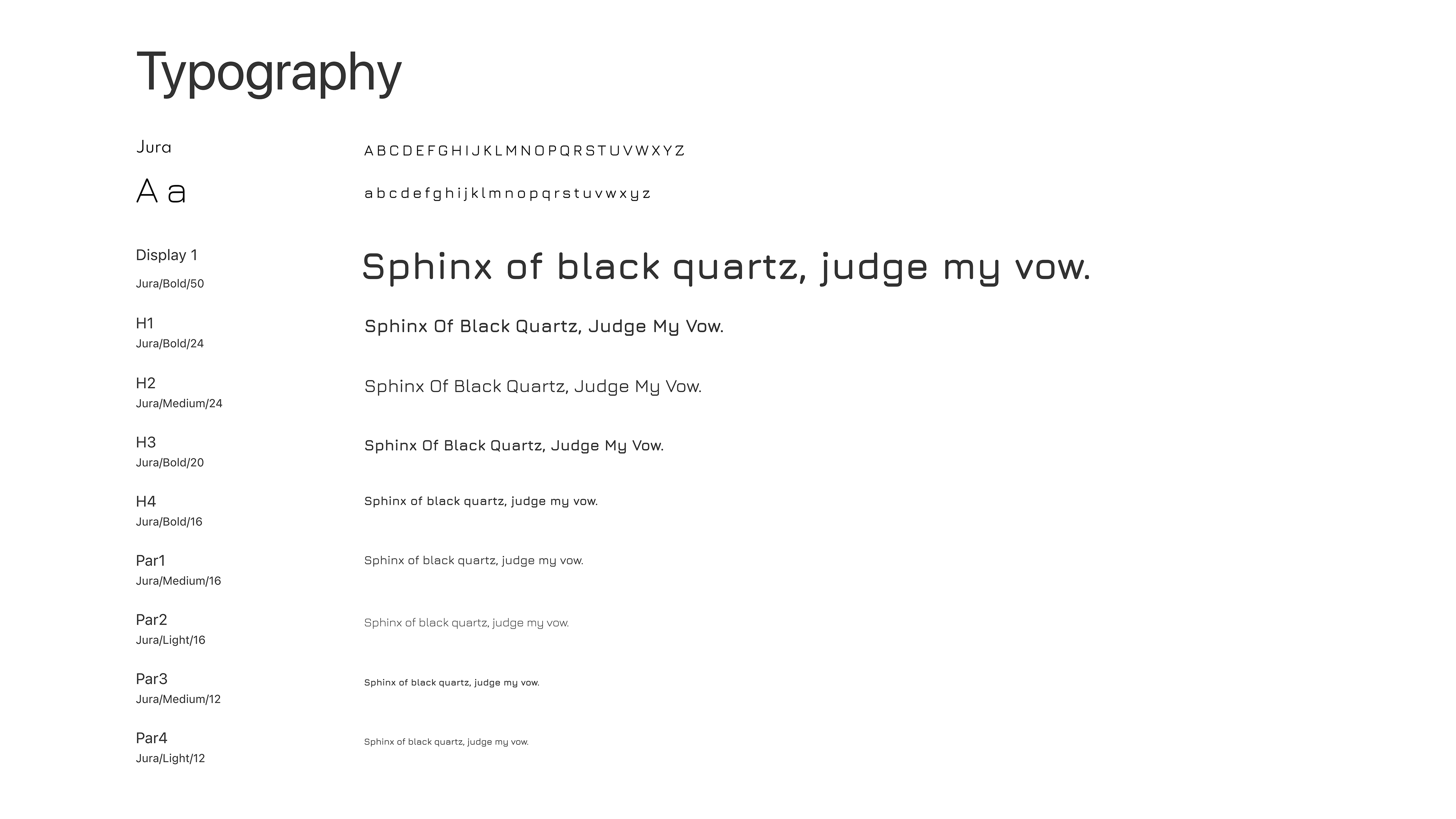
Font
In my previous prototype, I used Josefin Sans as the font. But upon reflection, I switched to "Jura" because the characters in the former were too small despite the font size. Jura has rounded edges, a clean and simple design, and is highly legible.

Atoms
If atoms are the basic building blocks of matter. They serve as the foundational building blocks that comprise all our user interfaces.
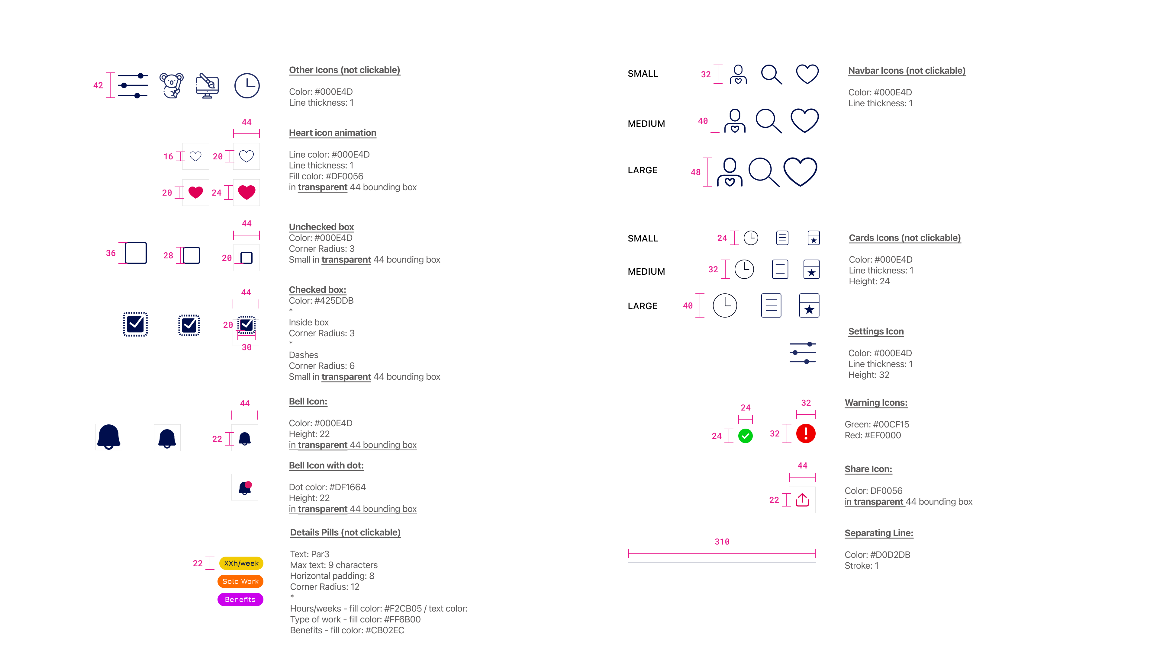
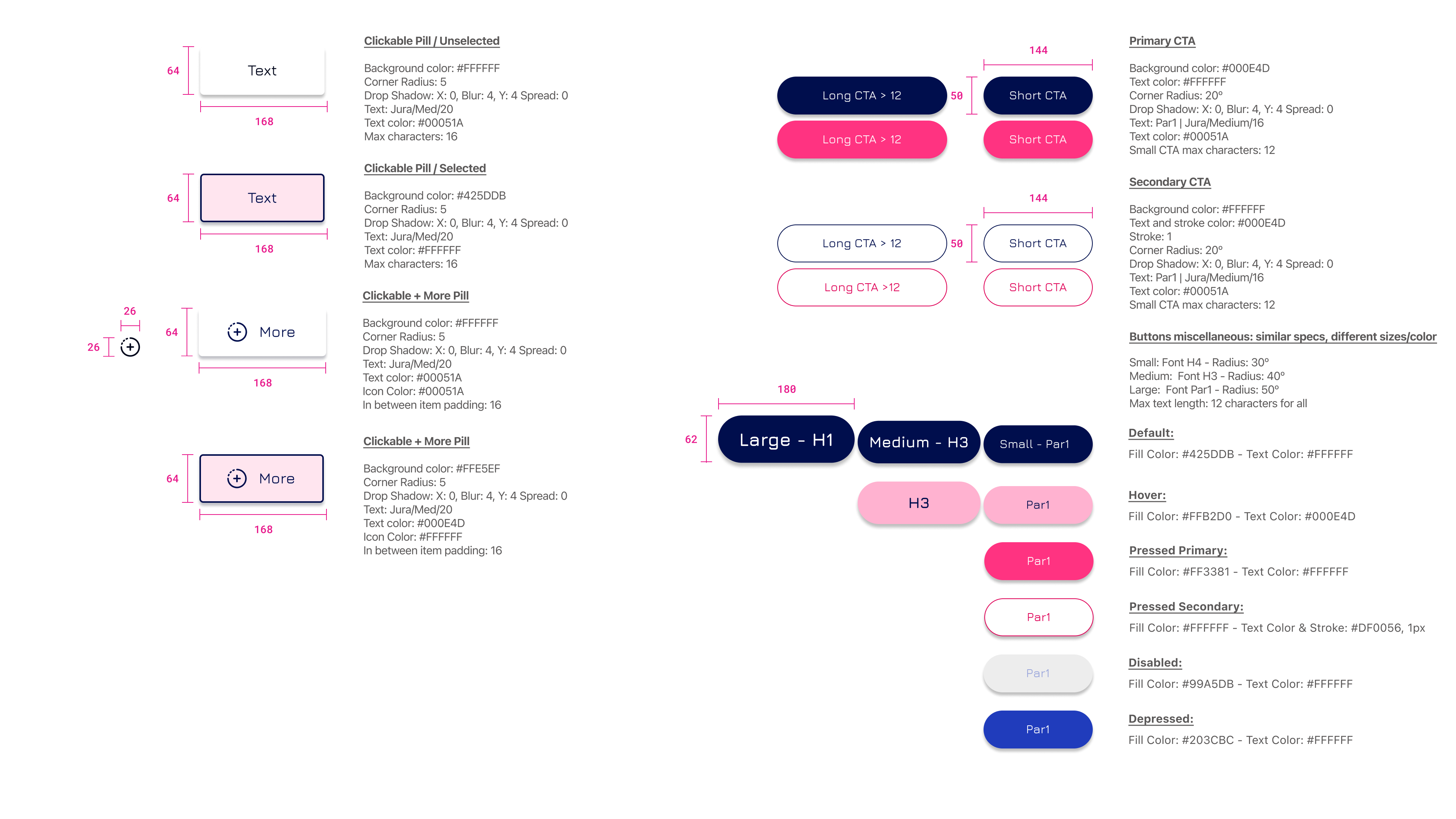
Molecules
In interfaces, molecules are relatively simple groups of UI elements functioning together as a unit. For example, a form label, search input, and button can join together to create a search form molecule.
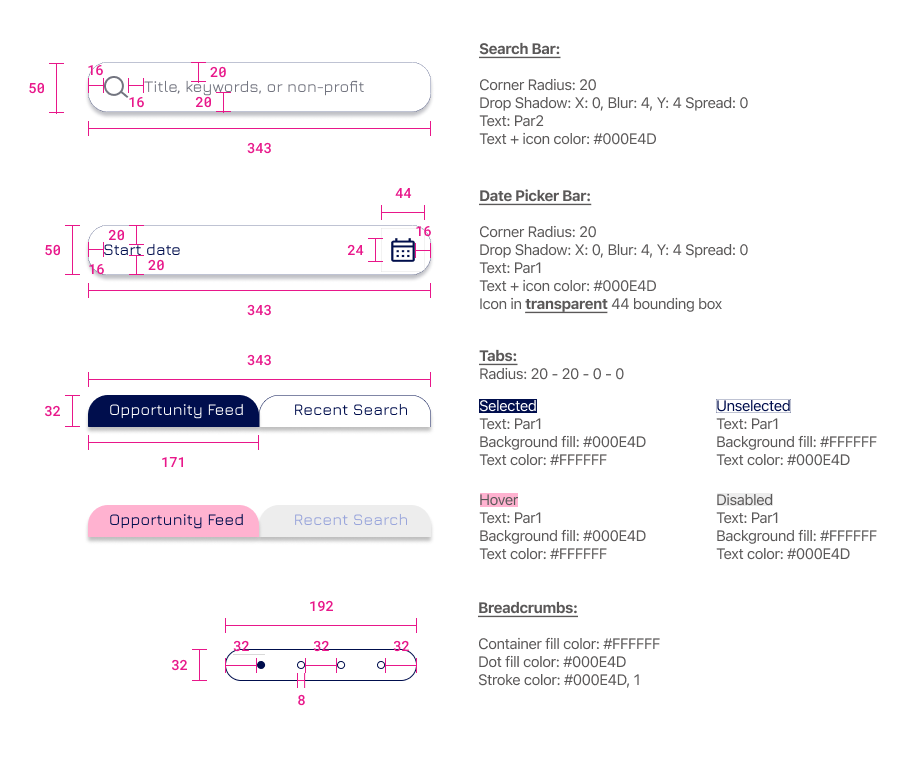
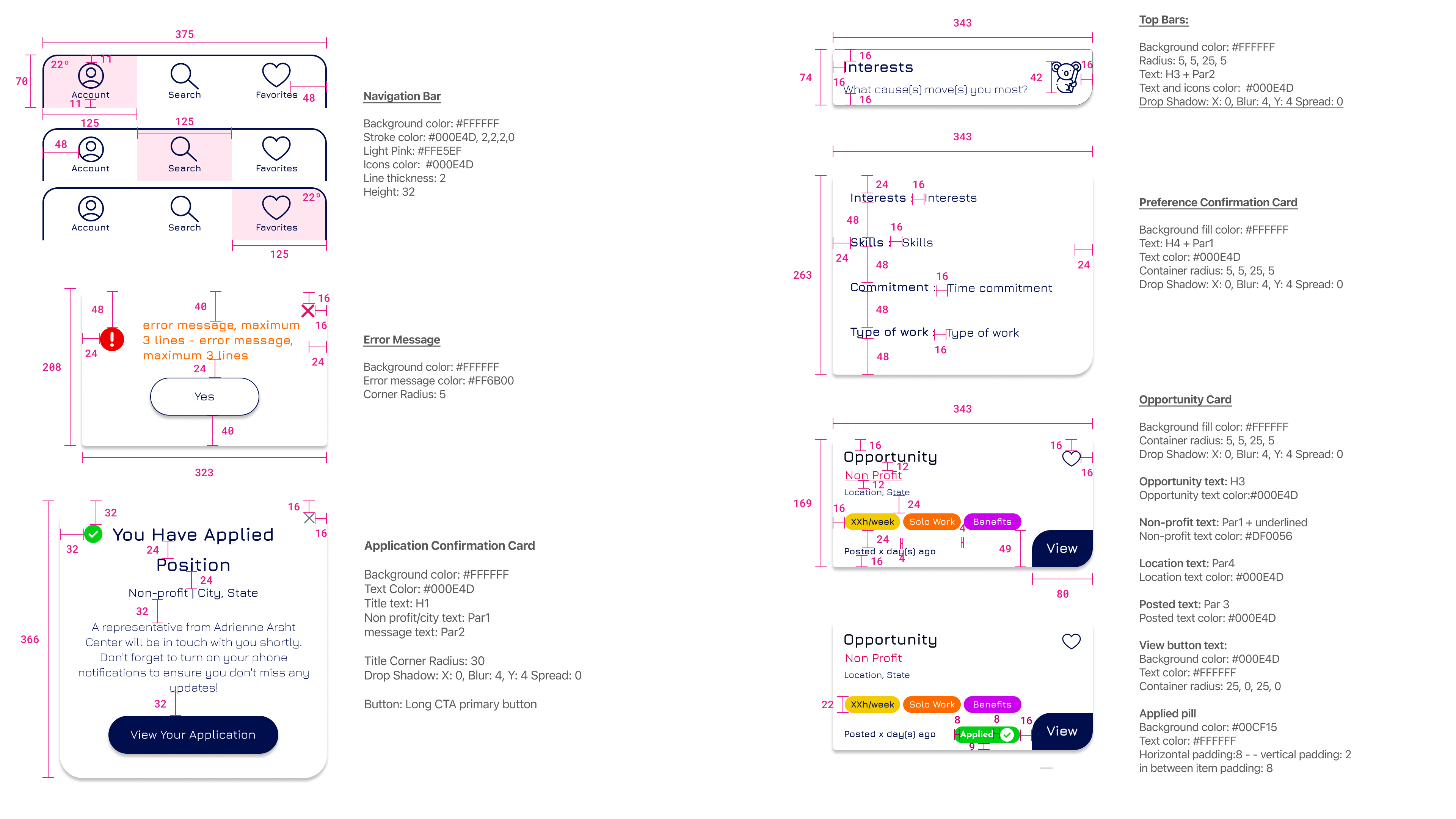
Organisms
Organisms are relatively complex UI components composed of groups of molecules and/or atoms and/or other organisms. These organisms form distinct sections of an interface.

Templates
Templates are page-level objects that place components into a layout and articulate the design’s underlying content structure. To build on our previous example, we can take the header organism and apply it to a homepage template.
Pages
Pages are instances of templates that display what a user interface will look like with representative content. For instance, we can take the homepage template and insert representative text, images, and media into it to demonstrate how the actual content will appear.


Next Steps
Create the non-profit platform of the app
Develop the web application
Final Thoughts
Through my experience I have learned the importance of being deliberate.This process has taught me the value of taking time to plan and organize before jumping into design work. Additionally, I have come to appreciate the iterative nature of the design process and the role that inspiration plays in creating a final product. In the future, I will apply these lessons to streamline my design process and create more effective and intentional designs.
Merci

Connect with me: