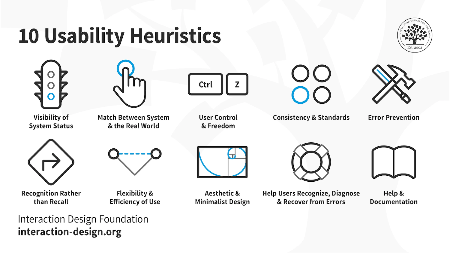
Heuristic evaluation (Nielsen and Molich, 1990; Nielsen 1994) is a usability engineering method for finding the usability problems in a user interface design so that they can be attended to as part of an iterative design process. For this project, we used Jakob Nielsen's 10 general principles for interaction design to evaluate the Broward County website during this assessment.
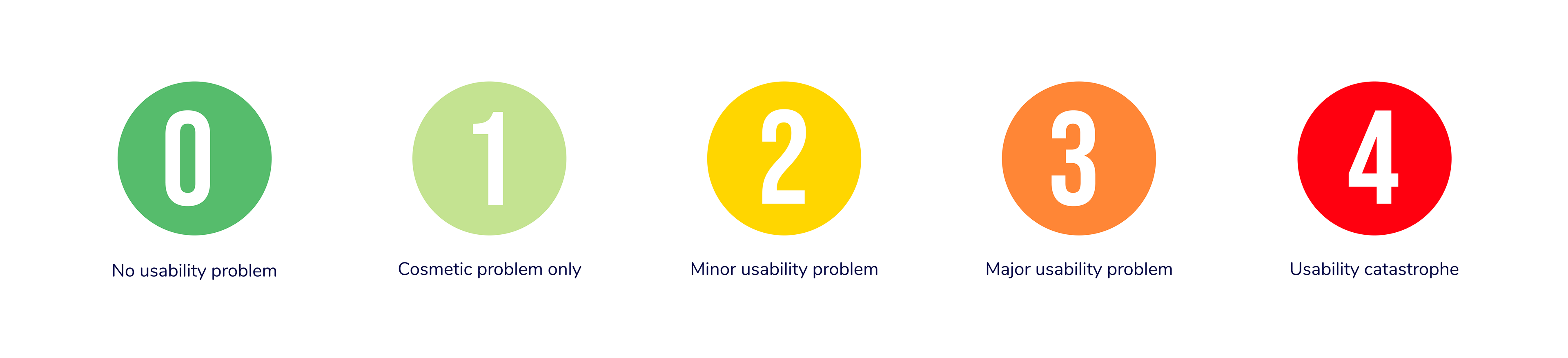
Our objective was to conduct the evaluation of the Broward County Library's website to assess its usability and provide actionable recommendations to improve the user experience. We use a severity scale going 0-4
We identified four usability issues and implemented corresponding design changes on the website to address them effectively.
#1. visibility of system status
The system should always keep users informed about what is going on, through appropriate feedback within reasonable time
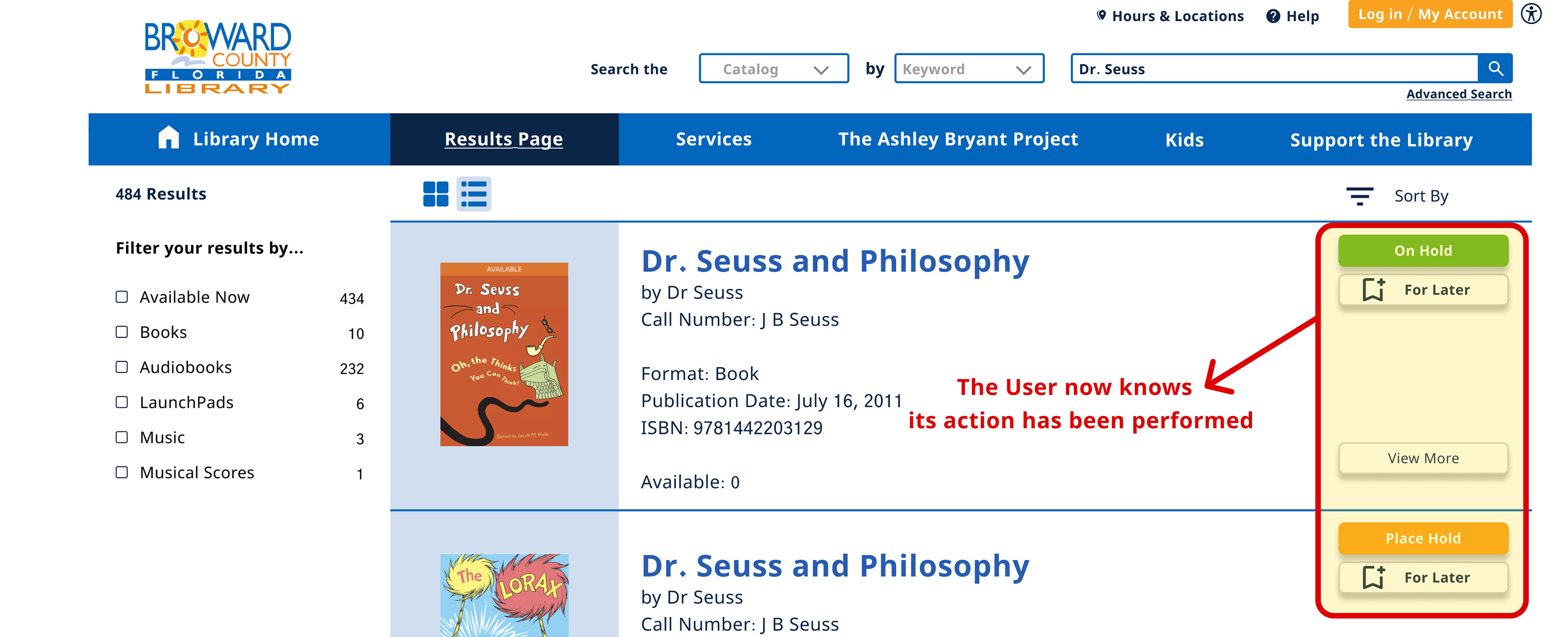
Violation #1: The system fails to effectively communicate its current state to the user. It lacks timely and informative feedback.
Recommendation #1: We utilize color changes when buttons are clicked to indicate a change in status. This helps users understand that their actions have been successfully registered.
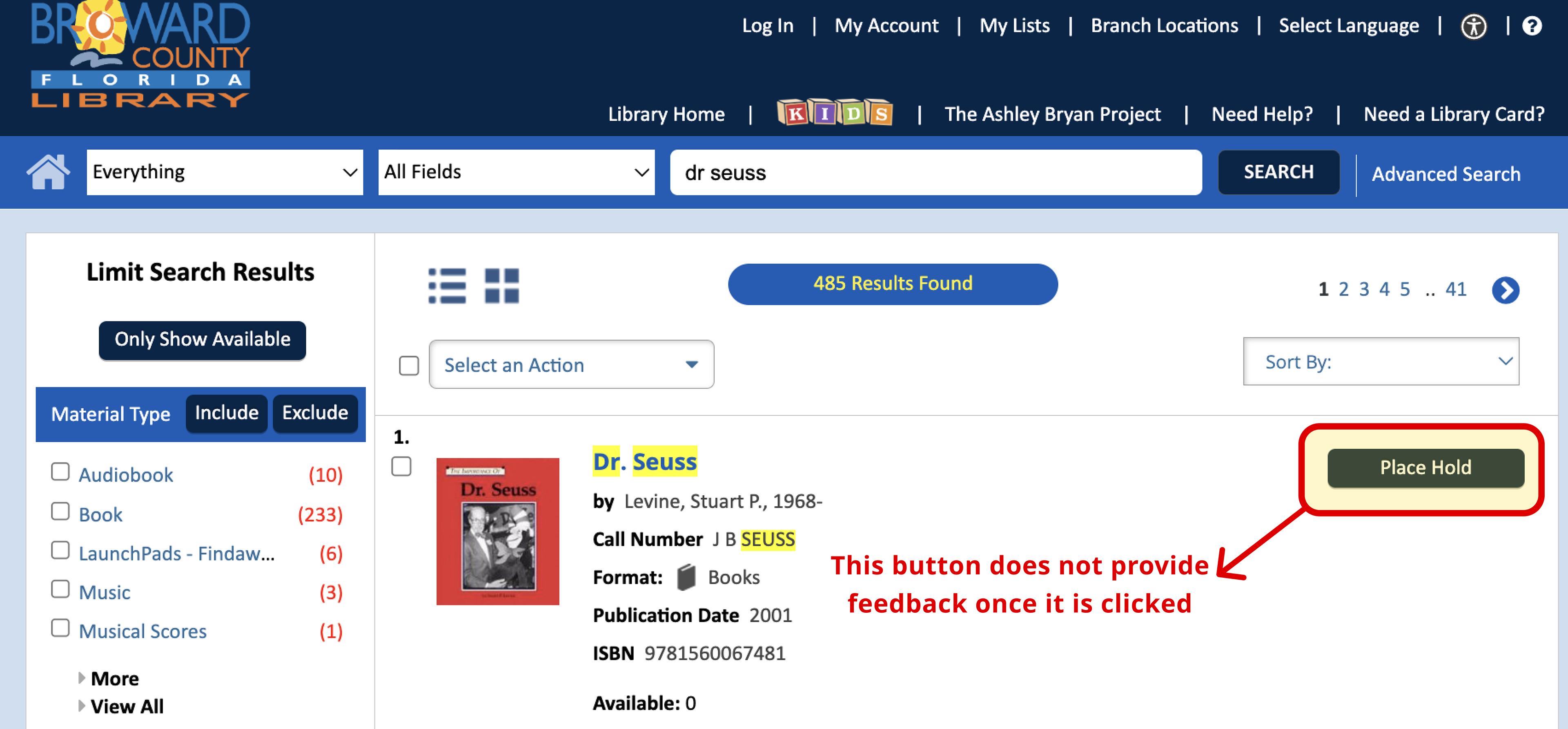
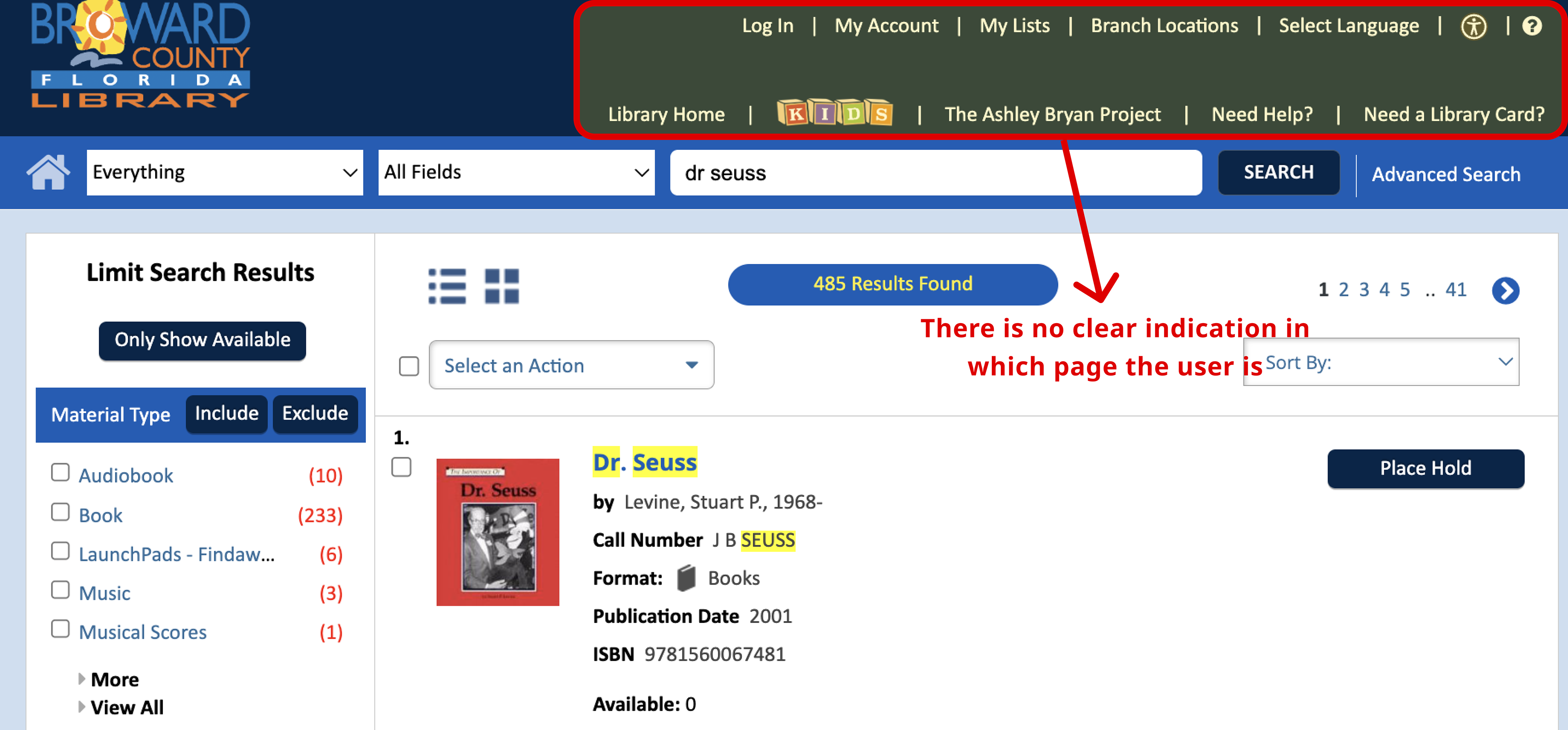
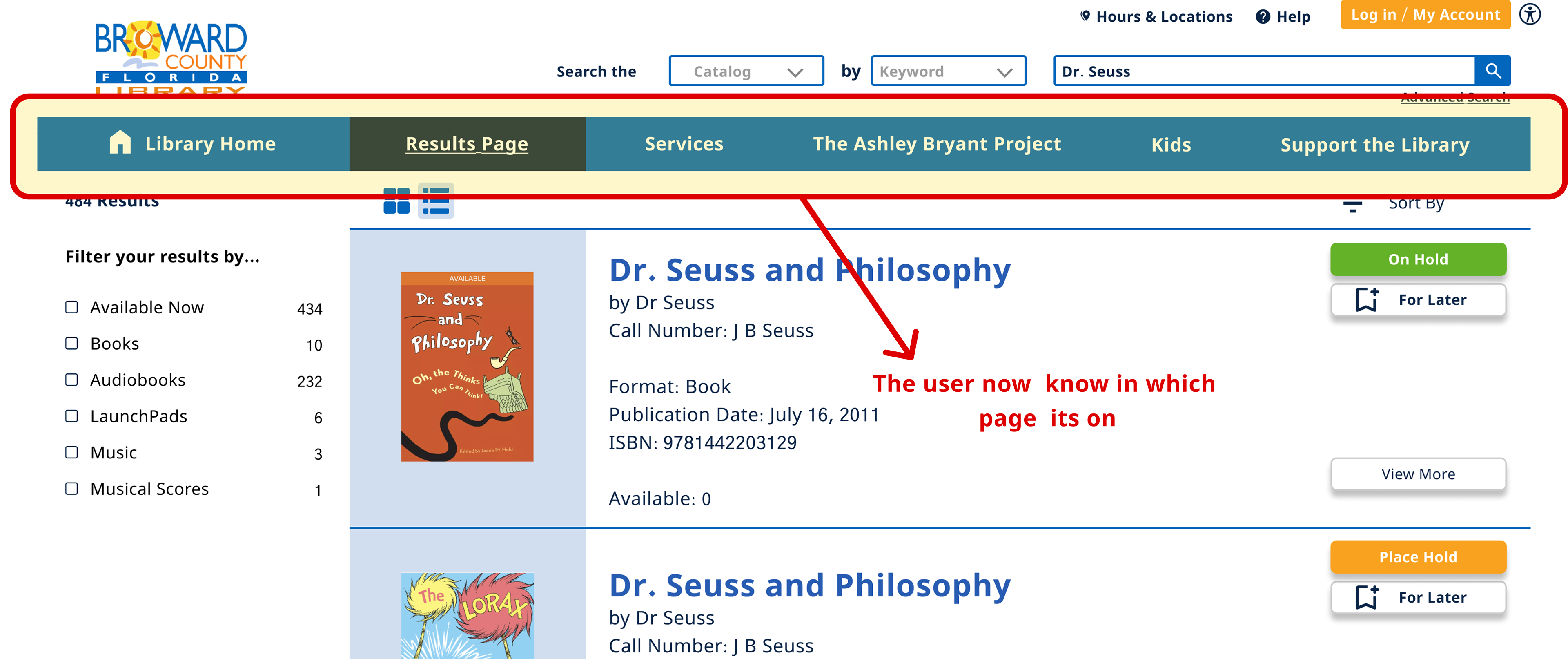
Violation #2: It does not provide feedback ideally or immediately.
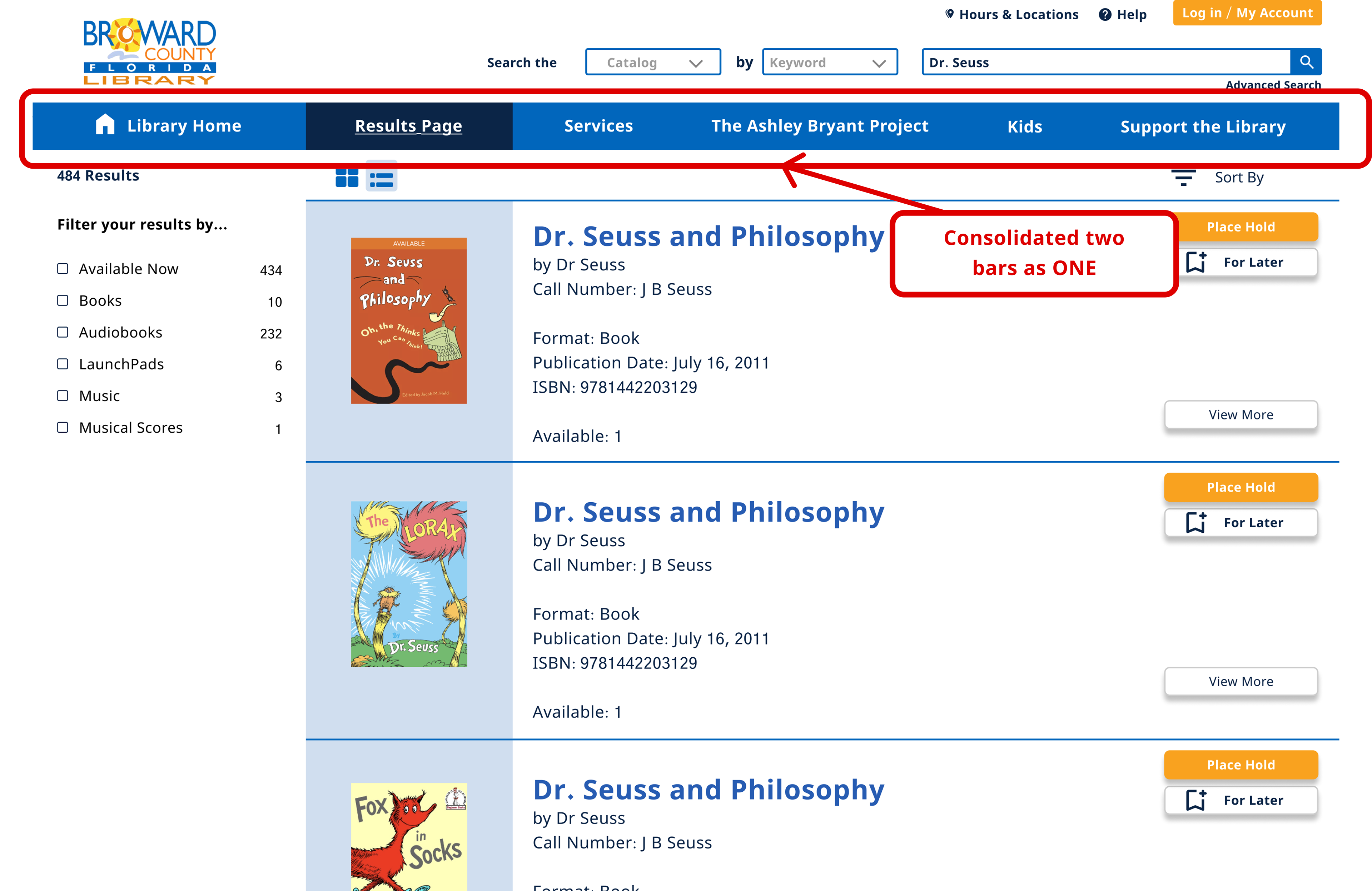
Recommendation #2: We consolidated the menu bars into one and created a darker hue to indicate where the user finds itself in the website
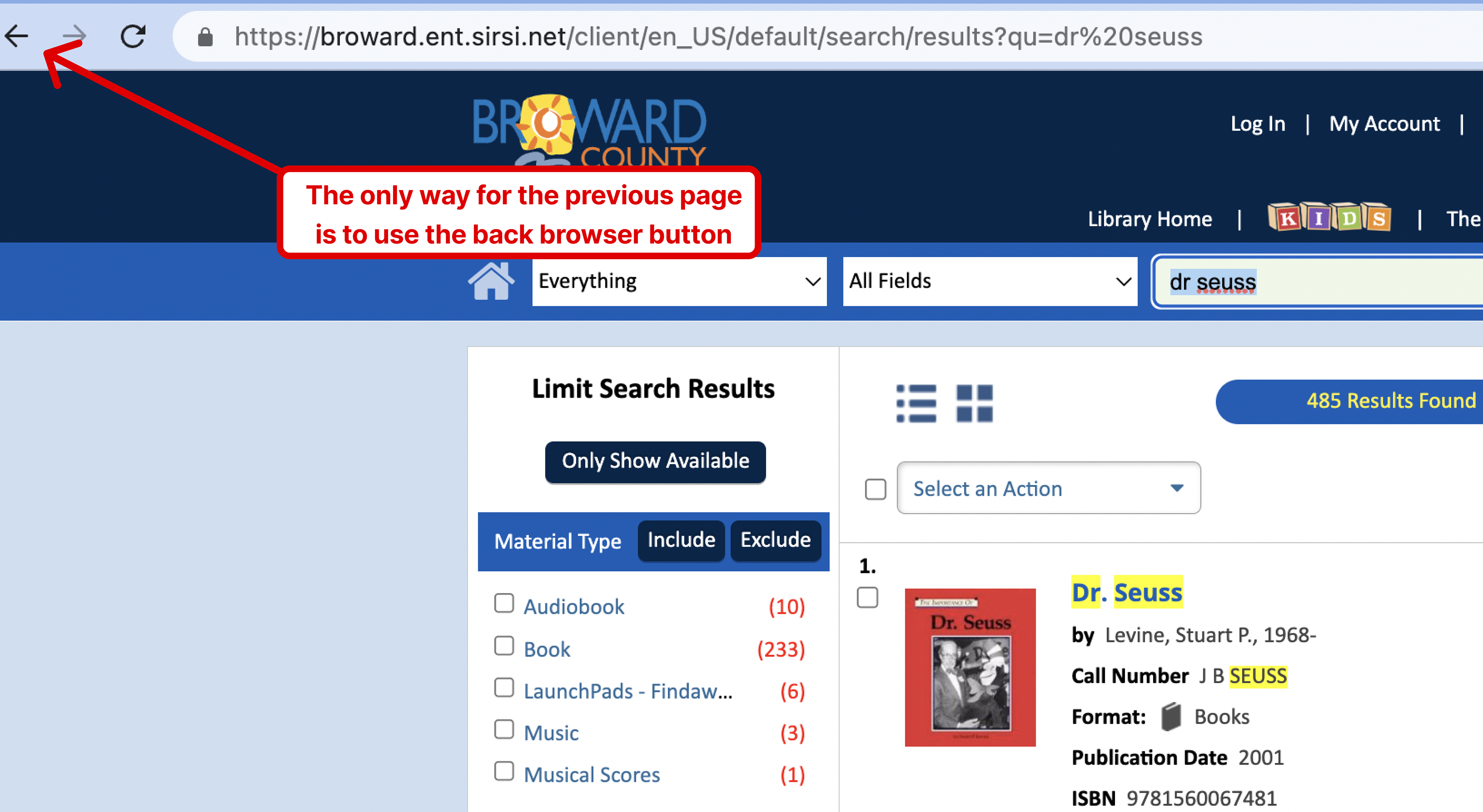
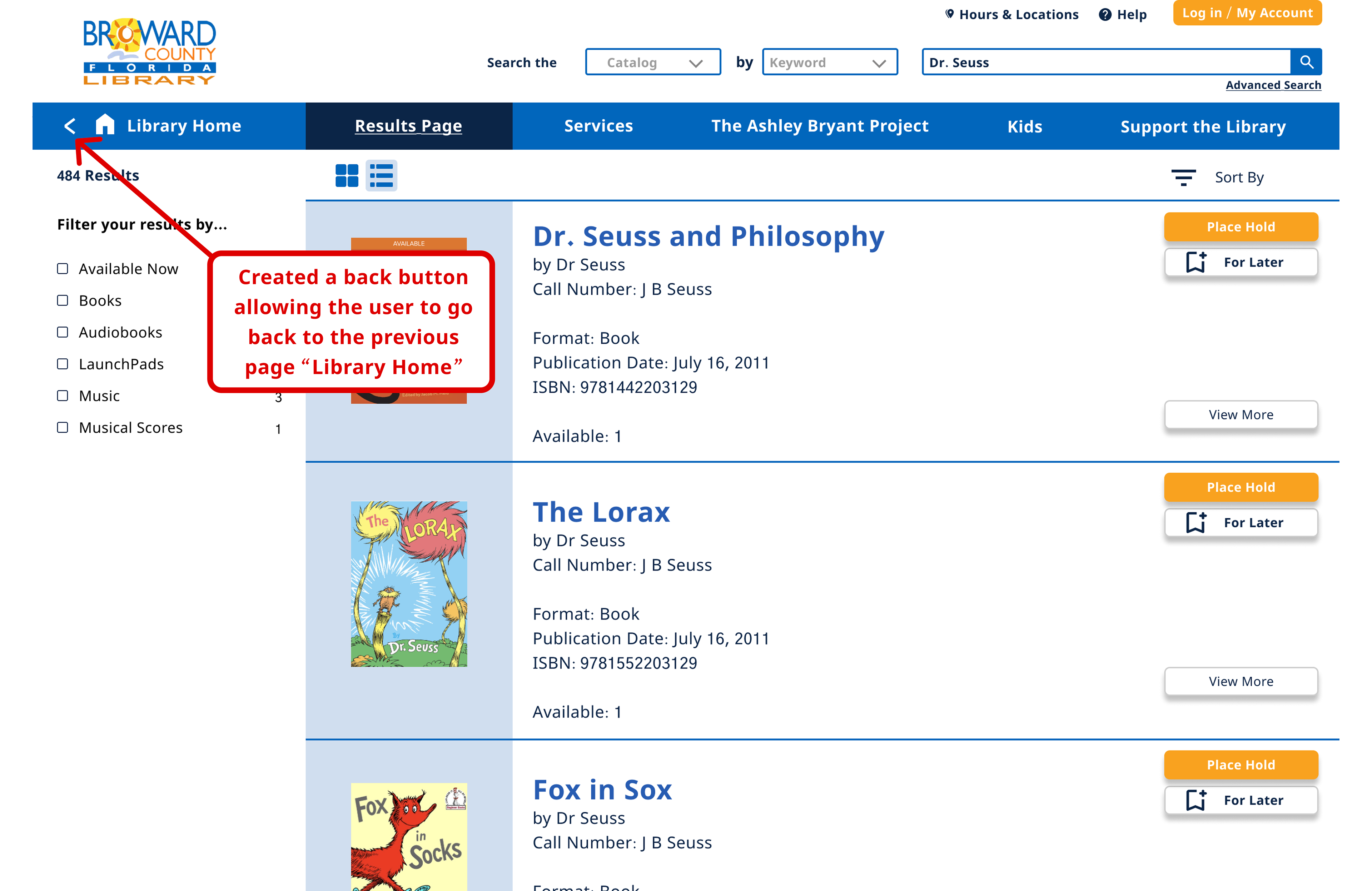
#3. User control and freedom
Users often perform actions by mistake. They need a clearly marked "emergency exit" to leave the unwanted action without having to go through an extended process.
Violation: The system fails to effectively communicate its current state to the user. It lacks timely and informative feedback.
Recommendation: We utilize color changes when buttons are clicked to indicate a change in status. This helps users understand that their actions have been successfully registered.
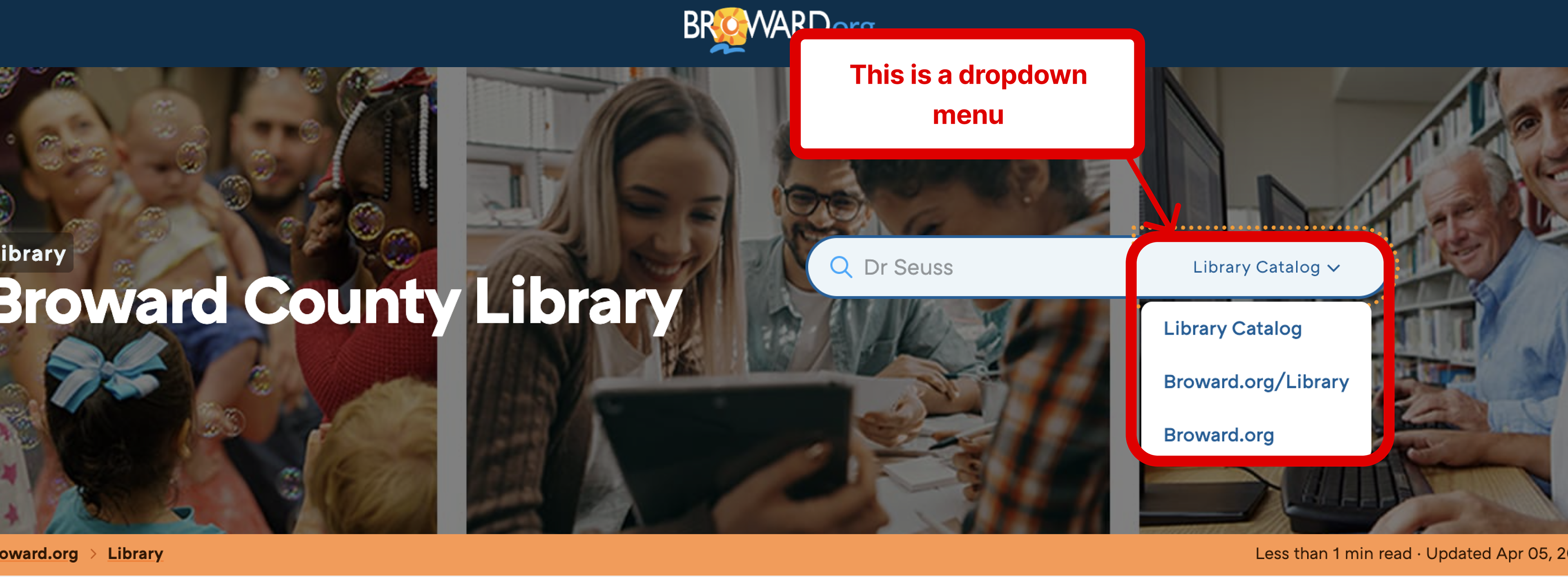
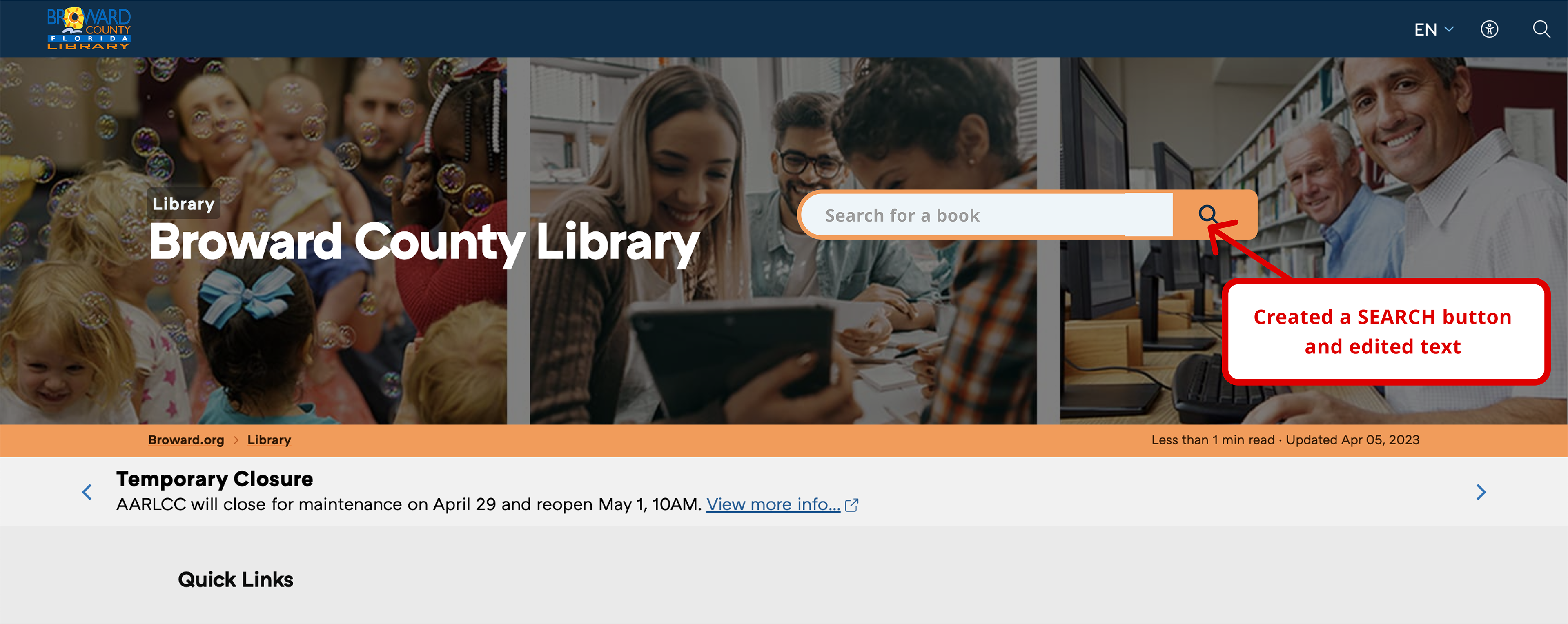
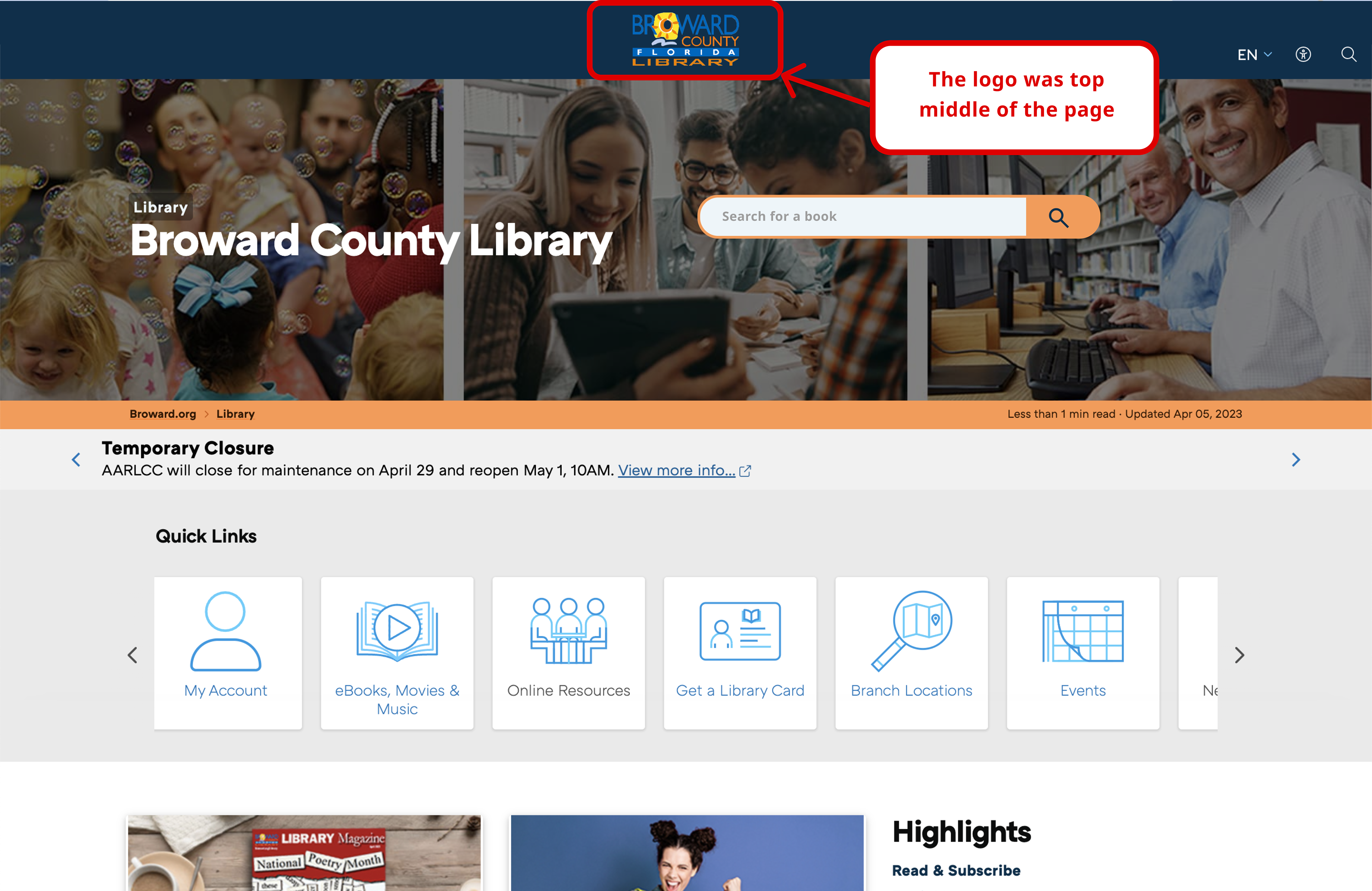
#4. Consistency and Standards
Users should not have to wonder whether different words, situations, or actions mean the same thing. Follow platform and industry conventions..
Violation: Search button should be visible and simple
Recommendation: Remove the Dropdown menu and create a simple Search Button instead.
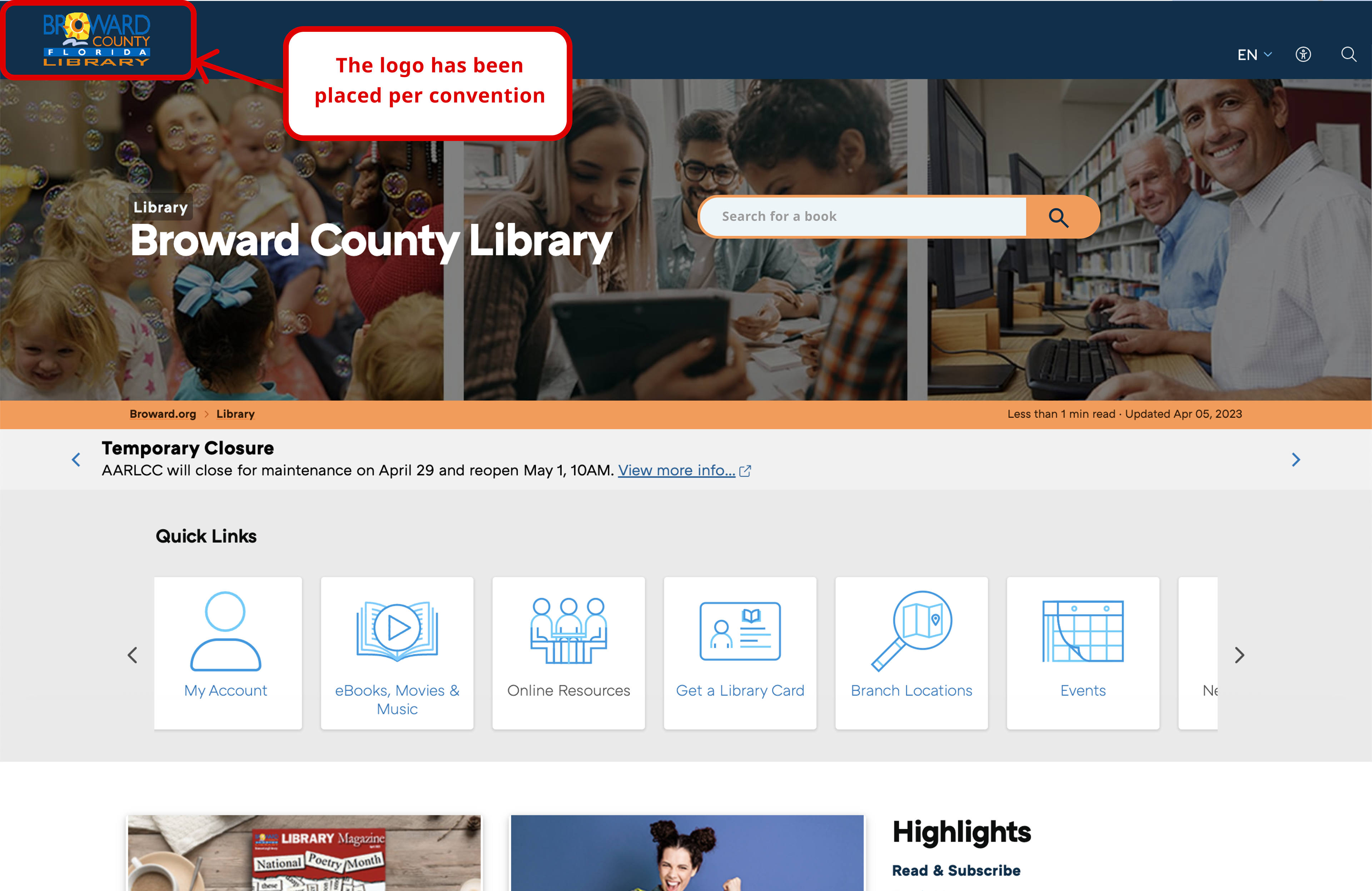
Violation #2: The website violates convention by placing its logo in the top middle instead of the expected top left corner.
Recommendation #2: Place the site logo at the top left of the page.
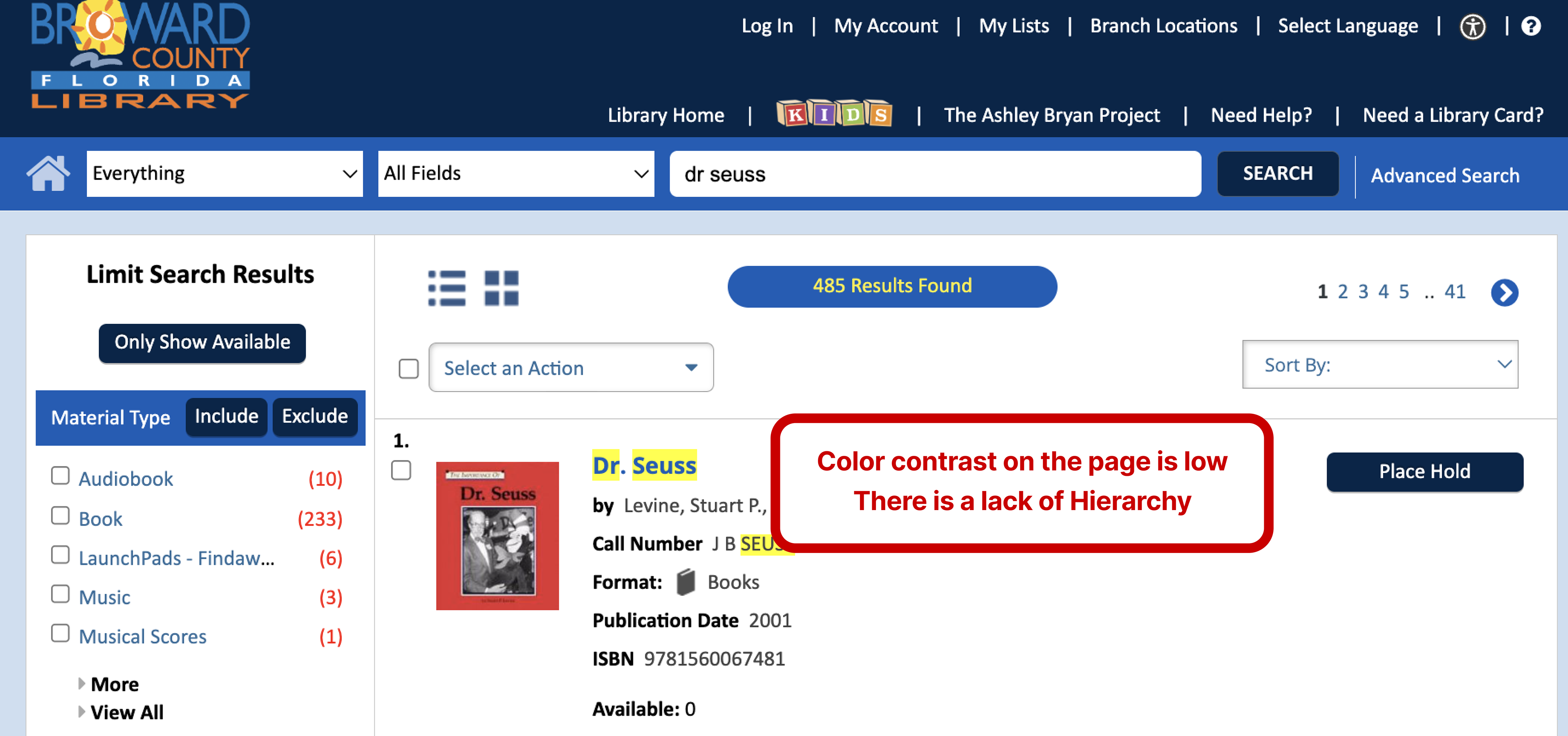
#8. Aesthetic & minimalist design
Interfaces should not contain information that is irrelevant or rarely needed. Every extra unit of information in an interface competes with the relevant units of information and diminishes their relative visibility.
Violation #1: Scale/visual hierarchy: Eyes should be guided toward what is important. Contrast: Everything is in shades of blue
Recommendation #1: Have different font sizes and weights to create a visual hierarchy and use colors to emphasize certain essential elements
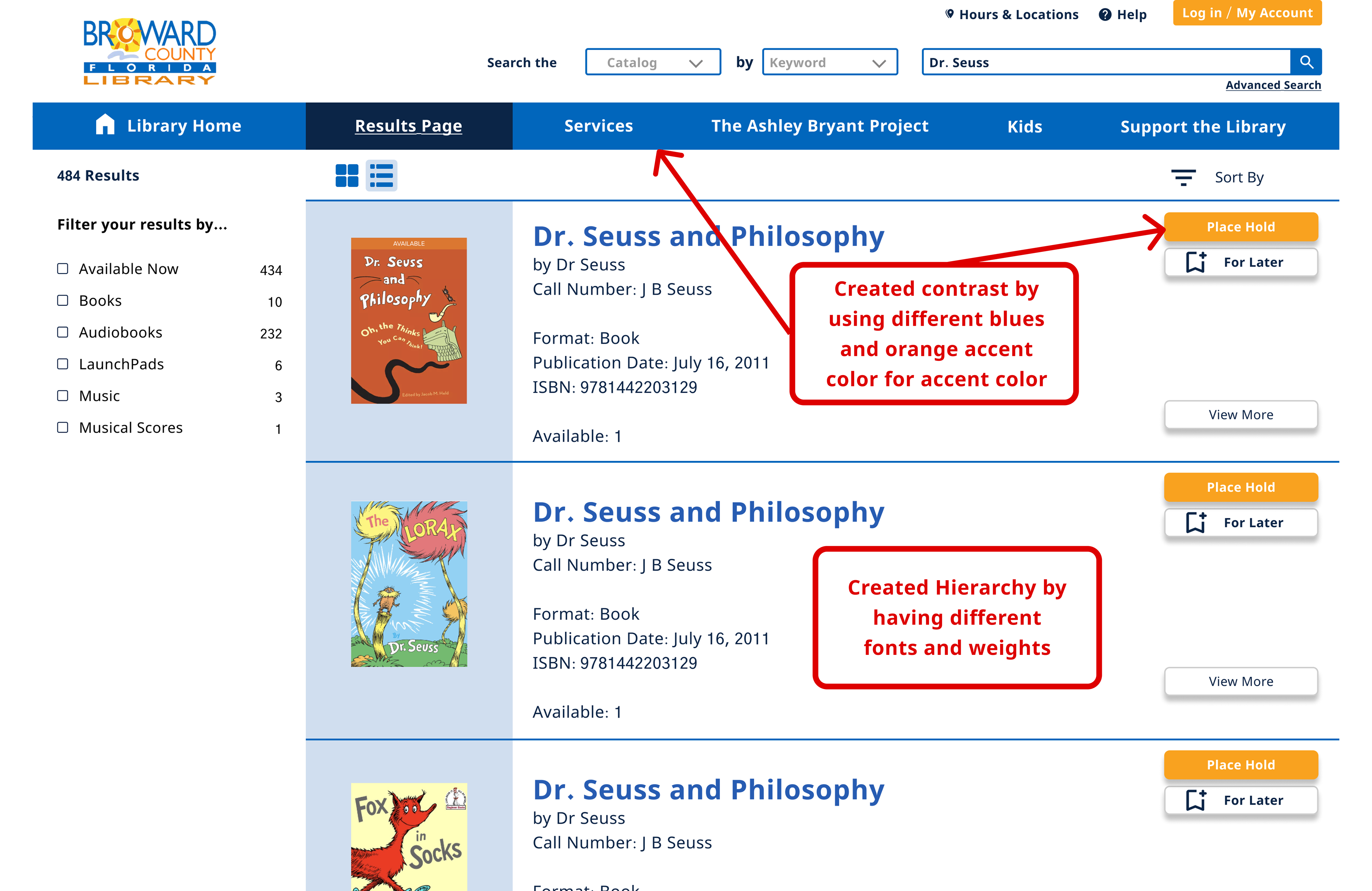
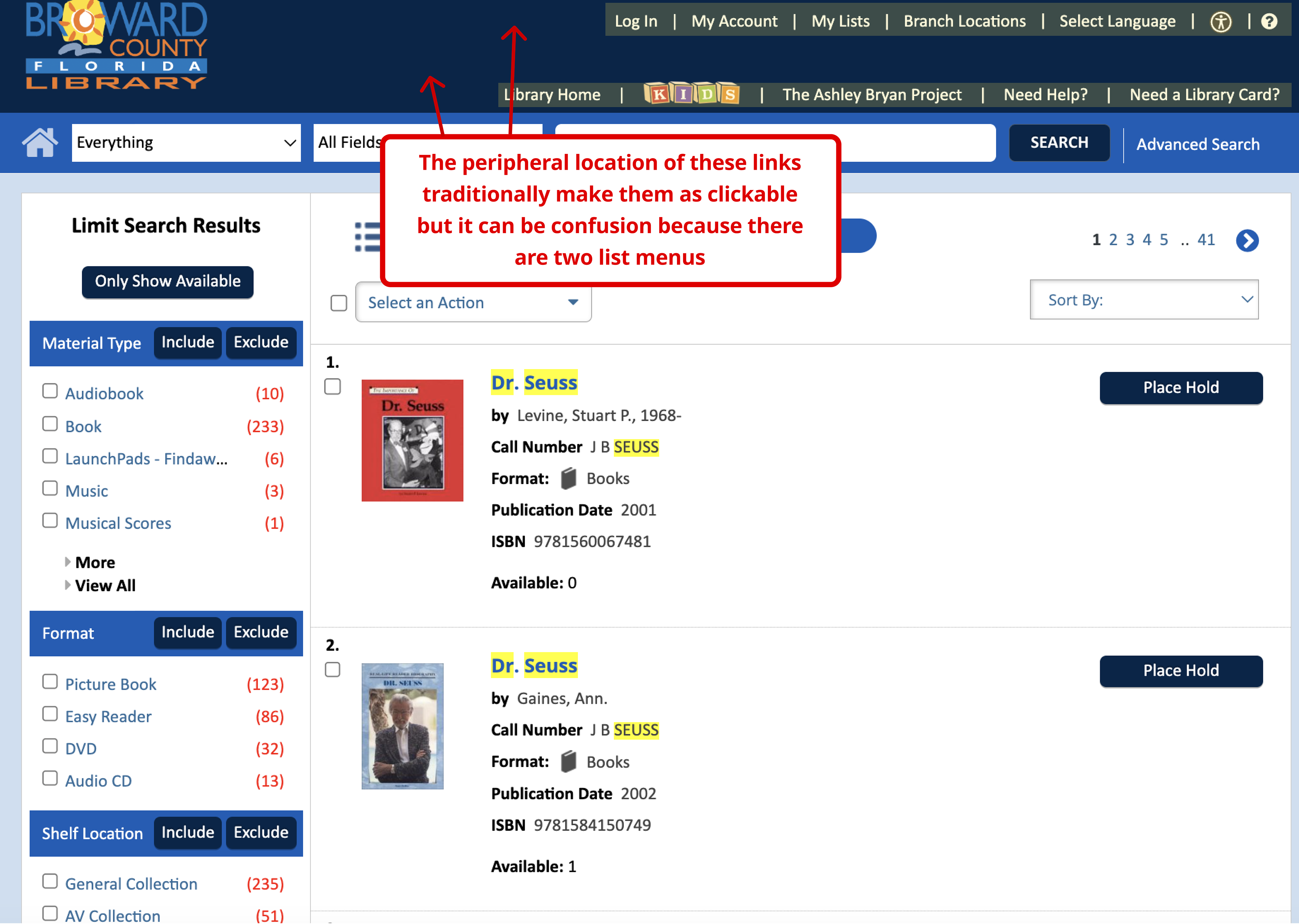
Violation #2: A flat design reduces user click uncertainty and reduces user efficiency. Never make users rely on scrubbing the screen with the mouse to determine if a text is clickable!
Recommendation #2: Rearranging the periphery into one instead of two bars and making clickable elements easily recognizable.
#10. Help and documentation
It’s best if the system doesn’t need any additional explanation. However, it may be necessary to provide documentation to help users understand how to complete their tasks.
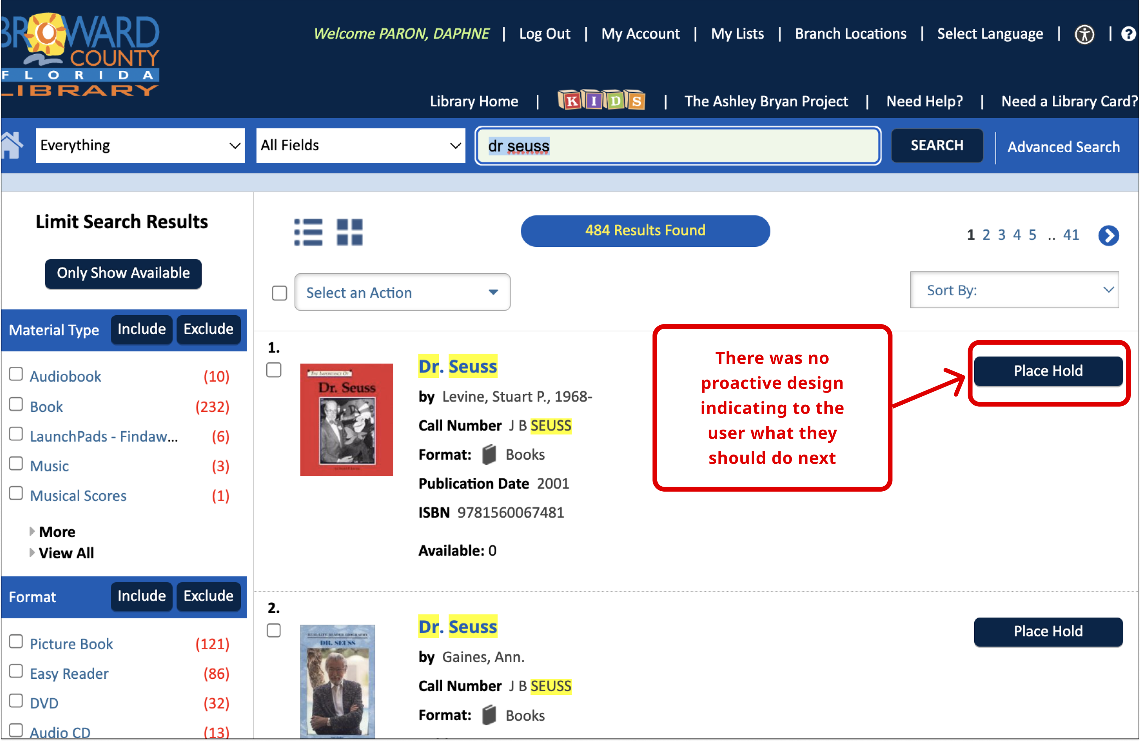
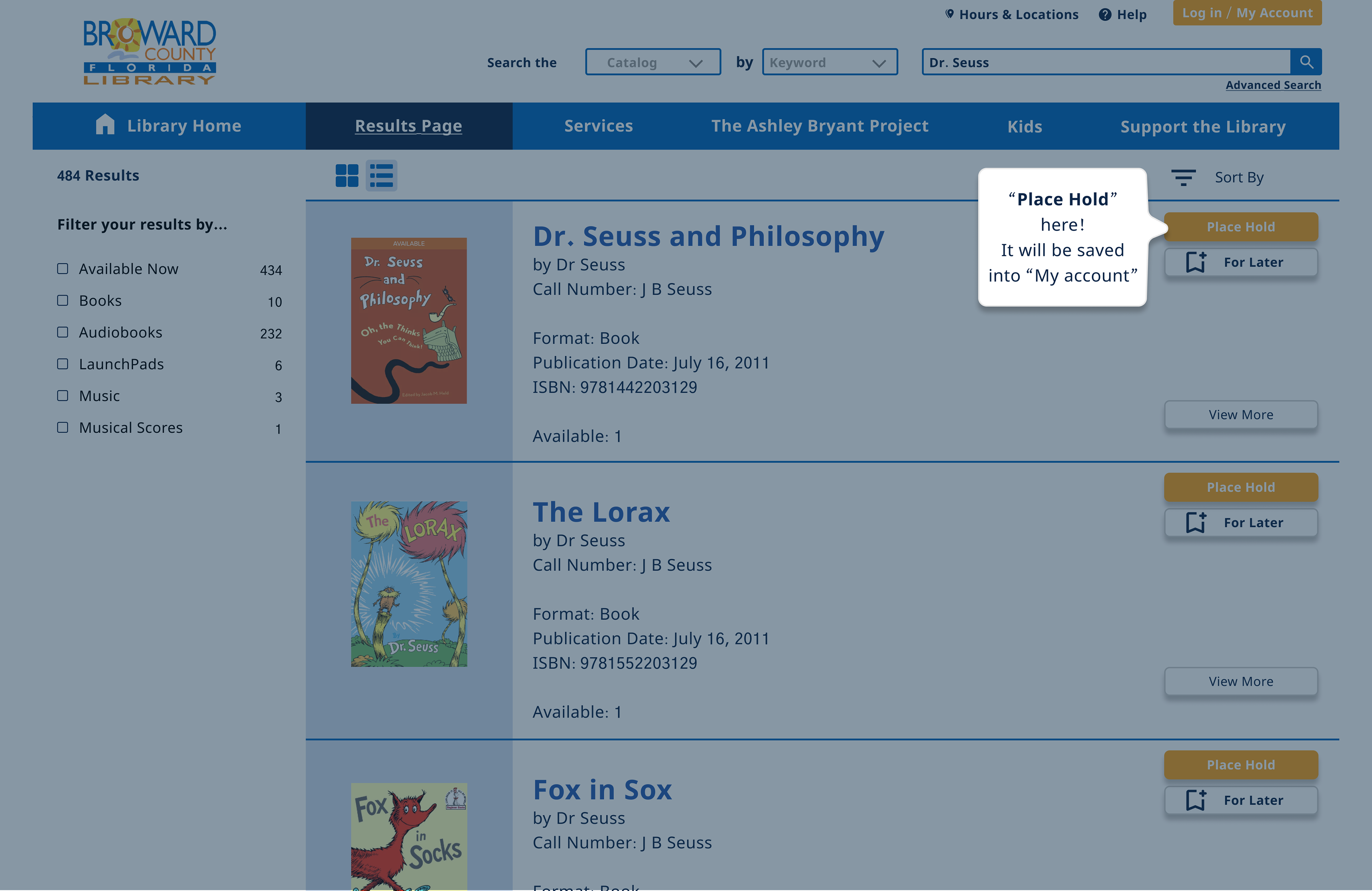
Violation: The user has no visible quick links or highlighted navigation options. No embarking video to know how to use the website.
Recommendation: Create proactive prompts to help the user navigate the site.
Key Learnings
1. Prioritization is important.
2. Keep accessibility guidelines in mind.
3. Content matters: Good content can improve the user experience.
Next Steps:
1. Perform usability test incorporating our proposed enhancements.
2. Evaluate mobile experience as well, in terms of responsiveness.
3. Continuous improvement is necessary.